Human-Computer Interaction
This is a case study for Rist, a MS-HCI project done in collaboration with my peers at the Georgia Institute of Technology.
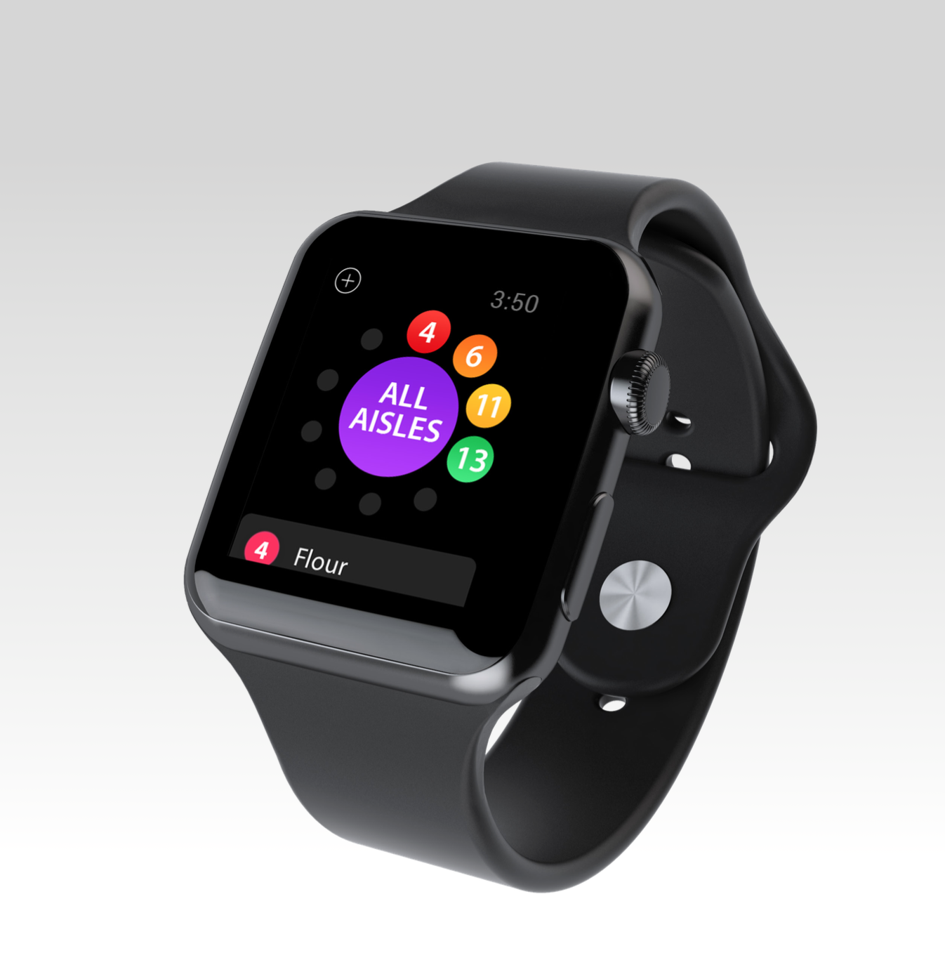
Rist is an Apple Watch prototype to help improve in-store shopping experiences. The core feature of this smart watch application is an aisle-based grocery list, which is user tested within the existing infrastructure of brick and mortar grocery stores. The complete system would require a companion iPhone app to import grocery lists and manage the Apple Watch app, as well as secure connections to the inventory database of respective grocery stores.
Great focus was given to streamlining the user experience via a multi-disciplinary team effort across industrial design, user research, web technologies, and market analysis.
Collateral:
Apple Watch app prototype.
Involvement:
Wireframing, user workflows, information architecture, rapid UI prototyping, usability inspections, and user research.
Tools:
FramerJS, Marvel, Adobe CS, and Sketch.
A grocery list right on your wrist.
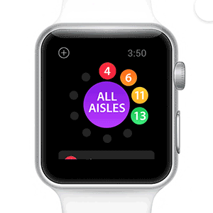
Aisle-based categorization
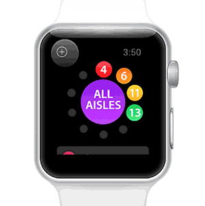
On-the-go voice editing
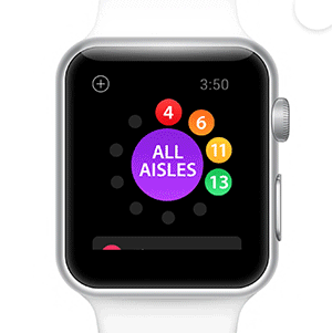
Intuitive touch gestures
The Problem
Parents who bring young children under the age of 7 to grocery stores often exprience a difficult time shopping. Indeed, children want to interact, pick up, and buy whatever they see desirable. We employed in-store observations and questionnaires at both Walmart and Target to validate the parents' need to expedite their shopping trips. We also corroborated that research with an online survey and had 90% of our target demographic support our assumption.
The Process
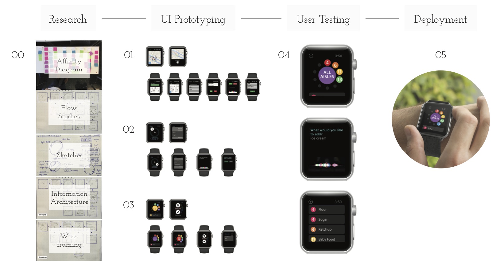
00 Quick preliminary artefacts such as an affinity diagram, user workflow studies, paper sketches, information architecture studies, and wireframes were produced before we committed to developing a solution. We considered using Google Glass as an alternative for example, but quickly rejected it due to its social acceptability issues after some user testing and literature review.
01 Our first prototype was a minuscule map with visually and informationally overloaded assistance. It was a naive solution that taught us the limits of the Apple Watch's screen real estate as well as a call for us to distill our user needs even more.
02 We utilized an abstract positioning system in our second iteration for legibility, but mistakenly set up a dichotomy between the grocery list menu and content items. Our users’ mental model expected a single page view with quicker access.
03 In our third iteration, we found out that what our users really needed to know, was the specific aisle number to which a grocery item is located. Duh. As a result of this user insight we narrowed down our implementation to a circular menu and a clear CTA to use Siri for voice commands.
04 After our explorations with intermediate artefacts, we tested the user interface with actual users in brick and mortar grocery stores. Our users got it; and they reported high levels of satisfaction. It was a beautiful moment.
05 We plan to deploy the smart watch application with a crowd funding initiative or business partnership in the future. Efforts have been made to generate investment interest.
The Journey
We set up meetings twice weekly for 4 months to tackle this problem. Slack was used for team communication and a Google drive was set up for all team files shared. We followed a user-centered process of design & develop, then monitor & discover to maintain an agile manner in obtaining user feedback, and more importantly, be informed when putting care and attention into our concepts for execution. Throughout the rapid iterations we conducted multiple digital and paper surveys, semi-structured interviews, contextual inquiries in-store, heuristic evaluations, cognitive walkthroughs, and expert usability inspections. All in all, in addition to producing an interactive prototype for demonstration purposes, 4 reports were written each month to document and communicate our findings and work.
Read the full story behind my iterative design process on medium. I explain personally what it took, what was explored, and what was discovered to bring this project to life.
Check it out!
Wander no more at the next grocery store you visit.
Recognition
I used this project to apply for my internship at Pixar Animation Studios and was employed from 05/23/2016 to 08/12/2016.