
Mayo Clinic Decision Aid
In spring 2016, Mayo Clinic partnered with Georgia Tech to redesign printed depression medication decision aids. The goal was to prototype a digital decision aid to help doctors facilitate conversations that are positive and constructive when treating patients with depression.
The iPad was selected as our target device for its mobility — doctors can easily hand it over to patients for view; additionally, there is the ease of potentially user-testing prototypes by deploying iPads in existing Mayo Clinic patient rooms. My project team delivered a prototype to demonstrate key features, and documented each step of the process for discussion and iteration purposes.
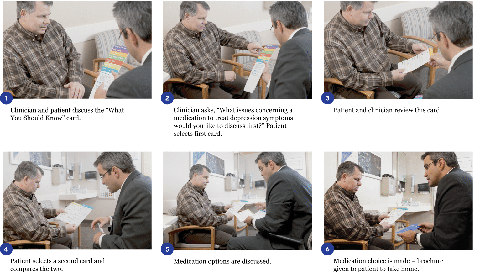
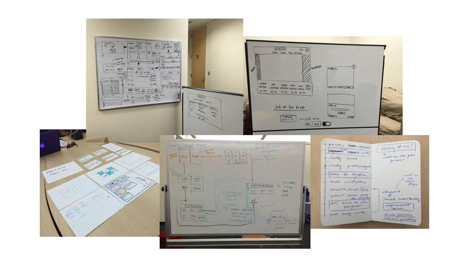
To understand user requirements, Mayo Clinic shared 3 private videos on confidential scenarios for the existing paper decision-making aids.
Collateral:
Depression medication choice aid prototype.
Involvement:
Literature review, wireframing, UX/UI design, and design vision.
Tools:
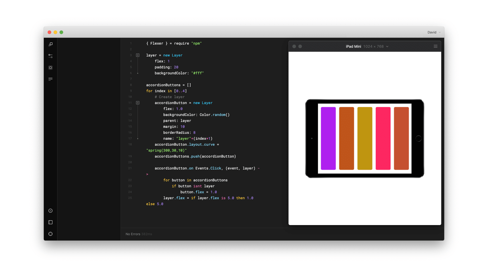
Balsamiq, Framer, Keynote, Sketch, and Adobe CS.
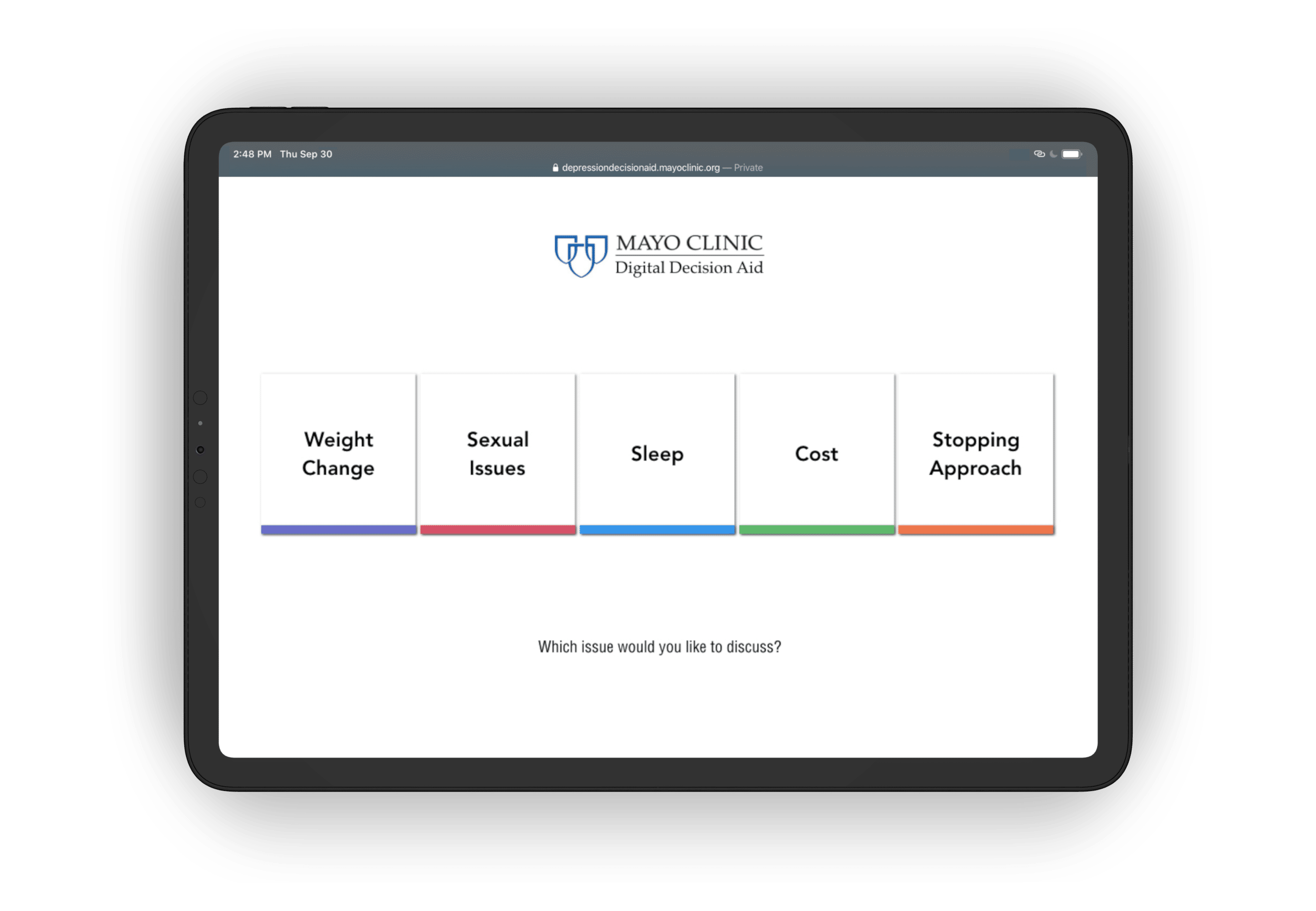
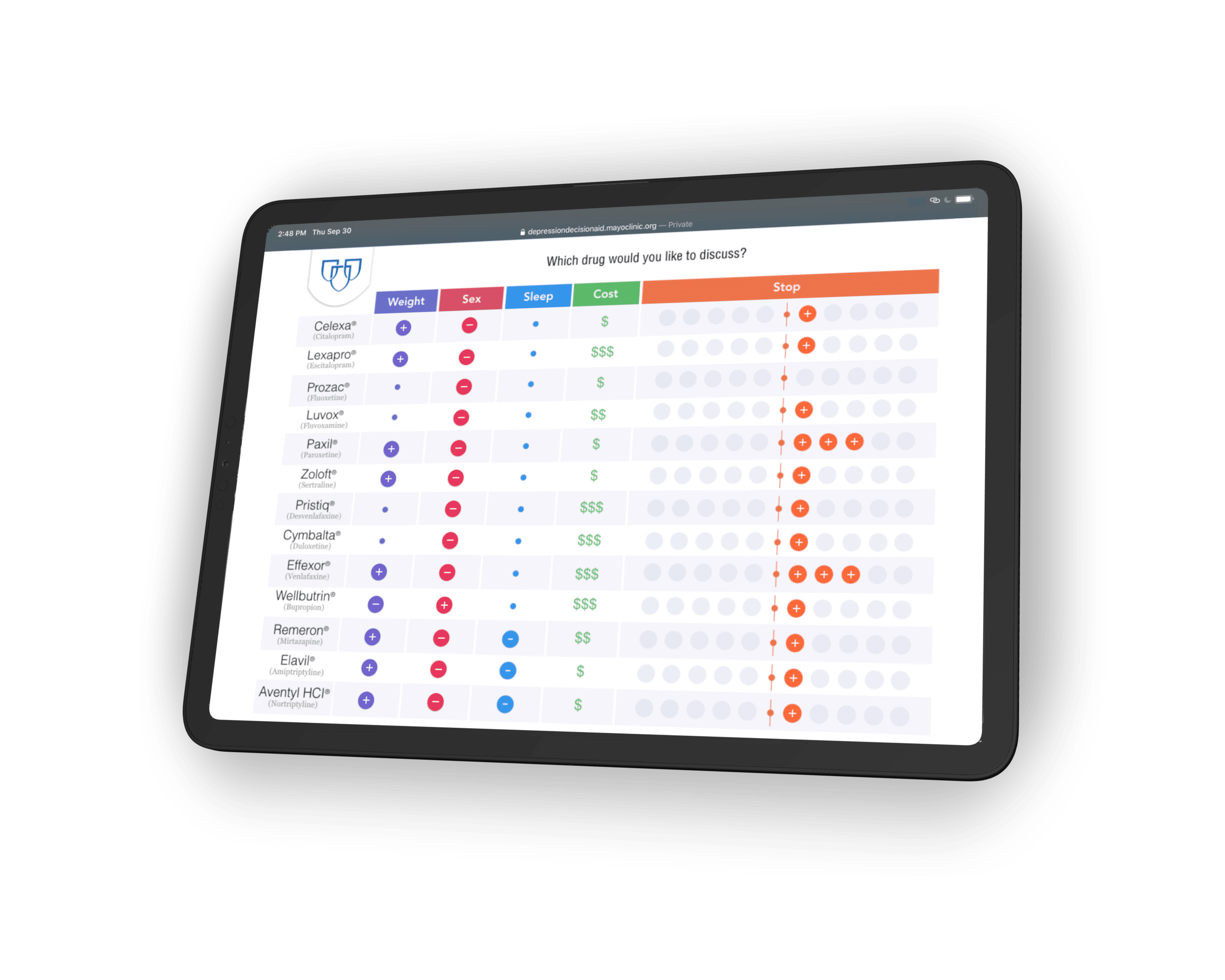
Mayo Clinic presented 13 medications to treat depression, each with their own pros and cons.
The Decision Aid
The existing decision aid (DA) provides evidence-based information about depression medication options, and their characteristics, to help patients take part in the decision making process during their visit at Mayo Clinic.
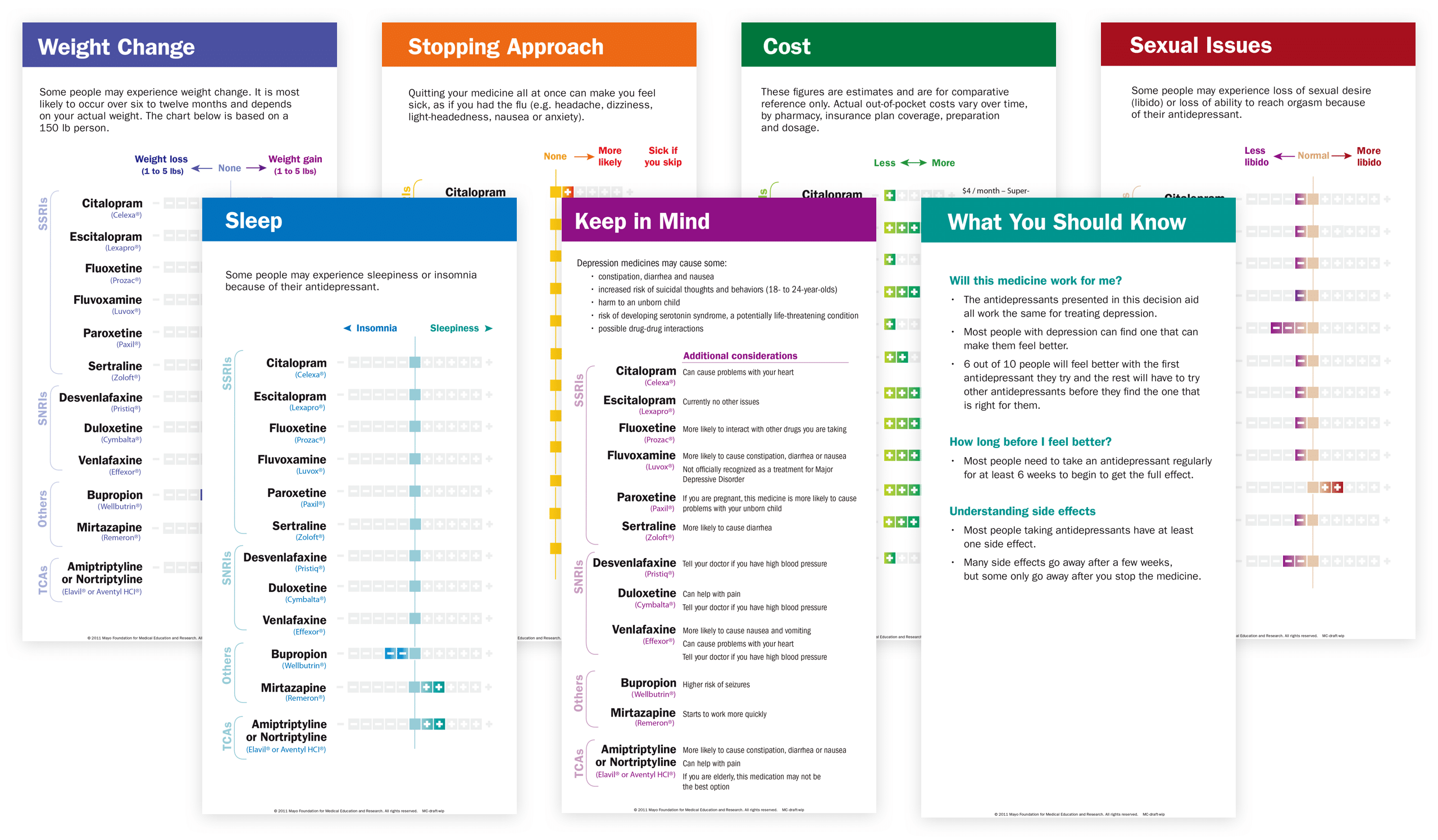
However, clinicians decide how and when to use, and may not elect to use the DA; typically 3-4 cards are used.
Storyboard
Designers at Mayo Clinic's Research Unit hosted conference calls to brief the project context, and provided 3 private videos that showed how the paper DA is used.
Experience Map
To understand the experience more deeply, I mapped out the associated emotions in each step of the decision-making process during a clinical visit.
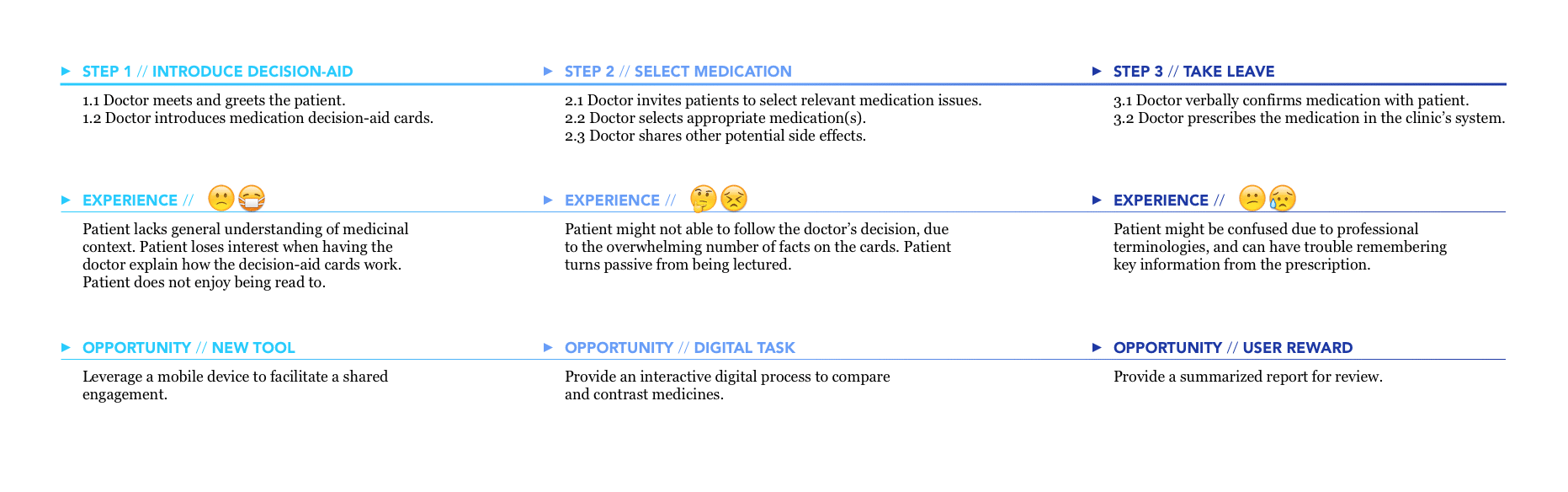
A patient may start out depressed, and frown at the need to understand medicinal context. But out of a need for better mental health, he or she will persevere by thinking through the clinician's overwhelming statements. At the end, the patient may feel relieved yet exhausted by the professional terminologies.
The Process
HMW waive the patient from the work of absorbing medical information, so the patient can attend to a conversation and the doctor can provide the right advice or guidance?

Design Decisions
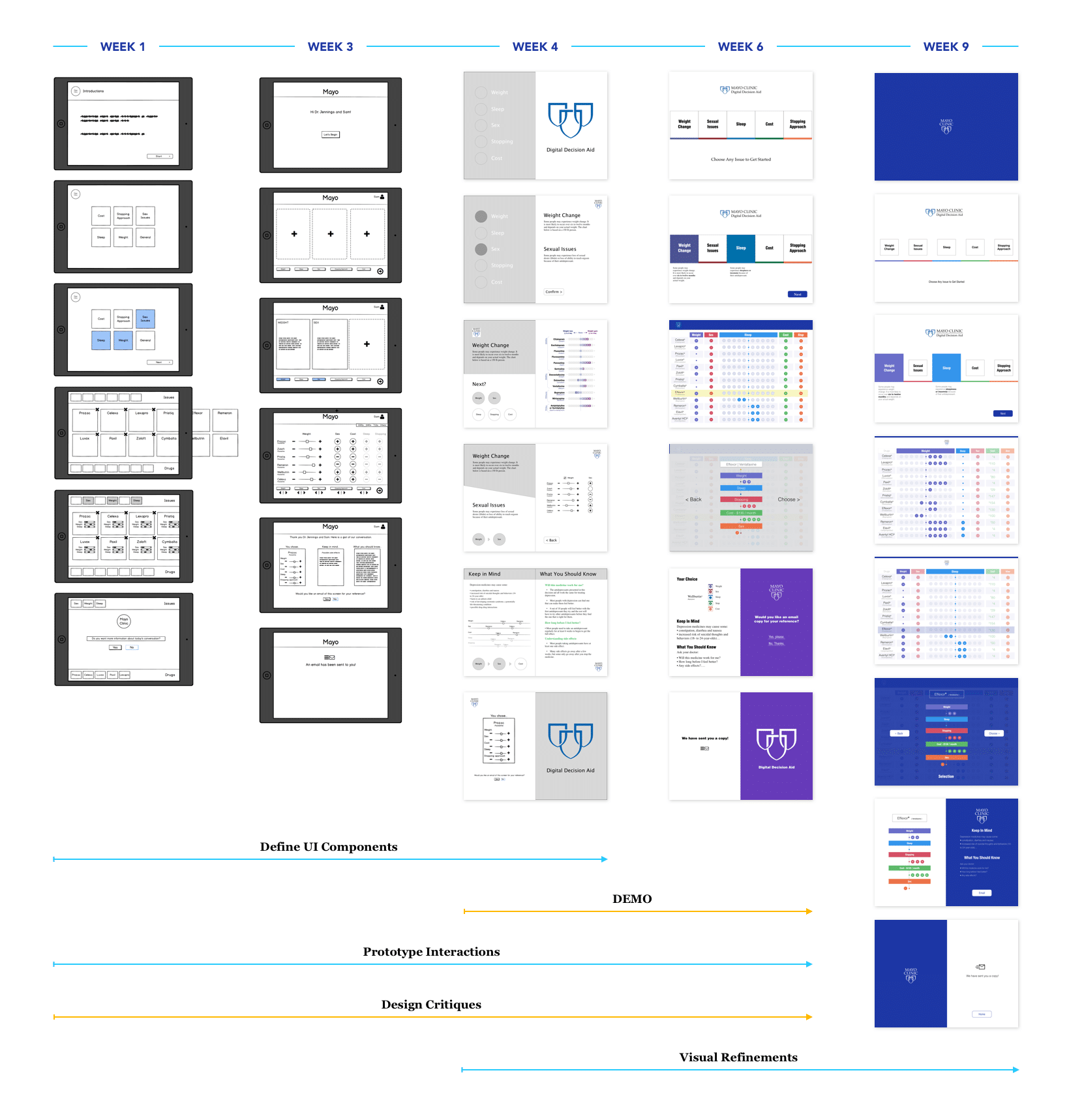
In total there were 7 rounds of design critiques/reviews for the core user flow. I share specific and final design details here. Micro-interactions edited during subsequent implementation.
Leverage Mayo Clinic’s brand logo to establish credibility and authority.
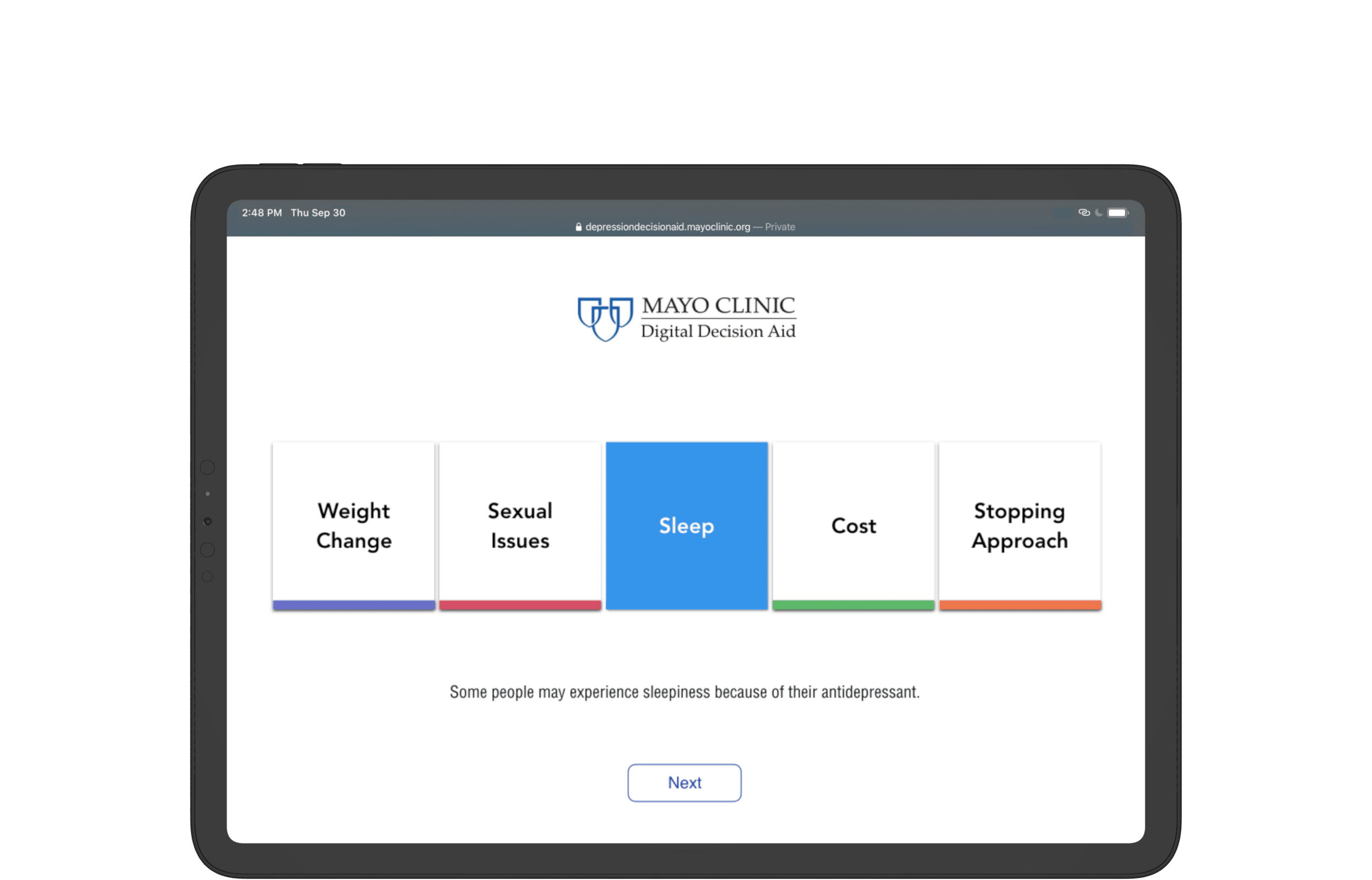
Use help-text to provide medical context for selections.
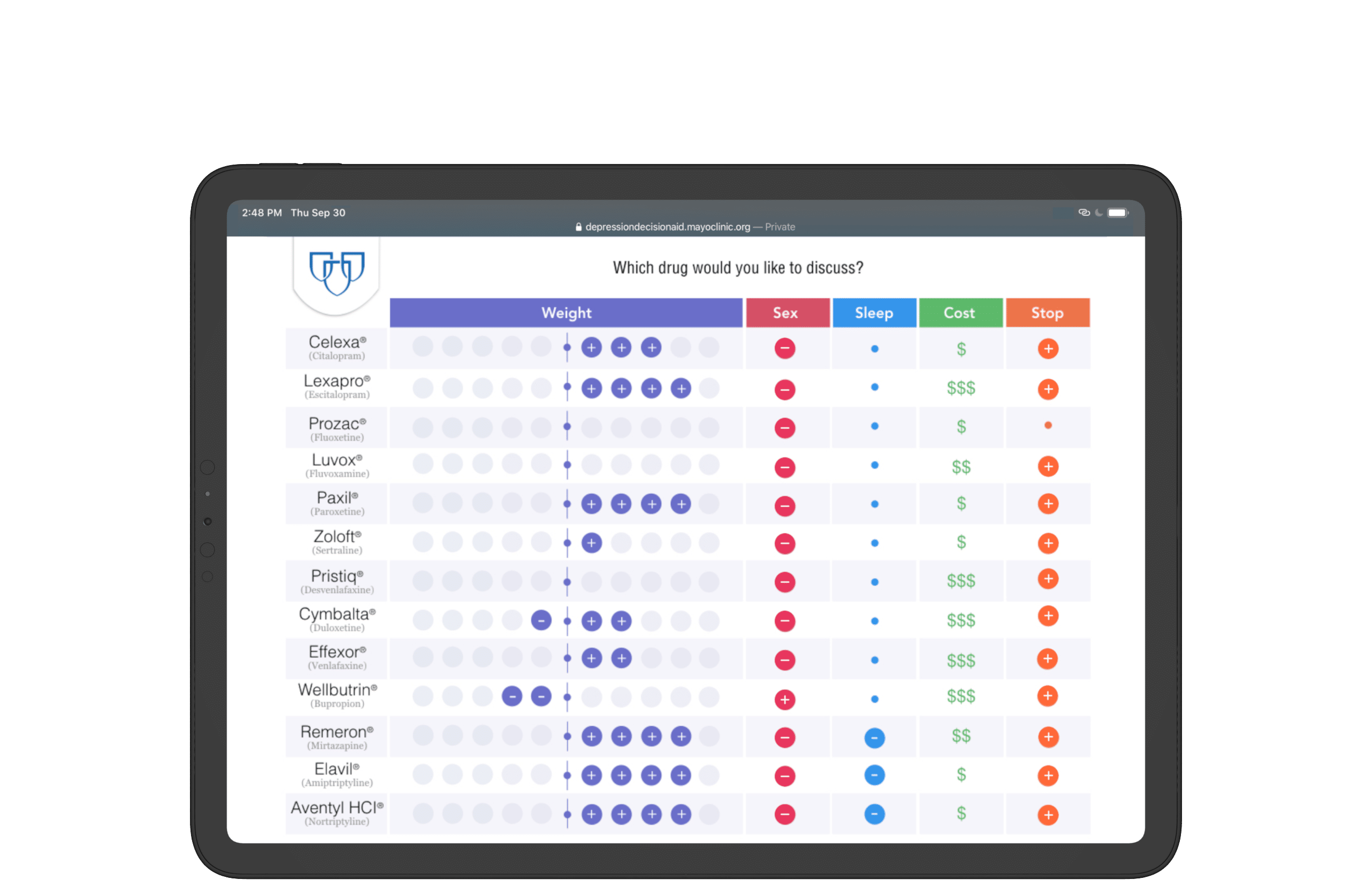
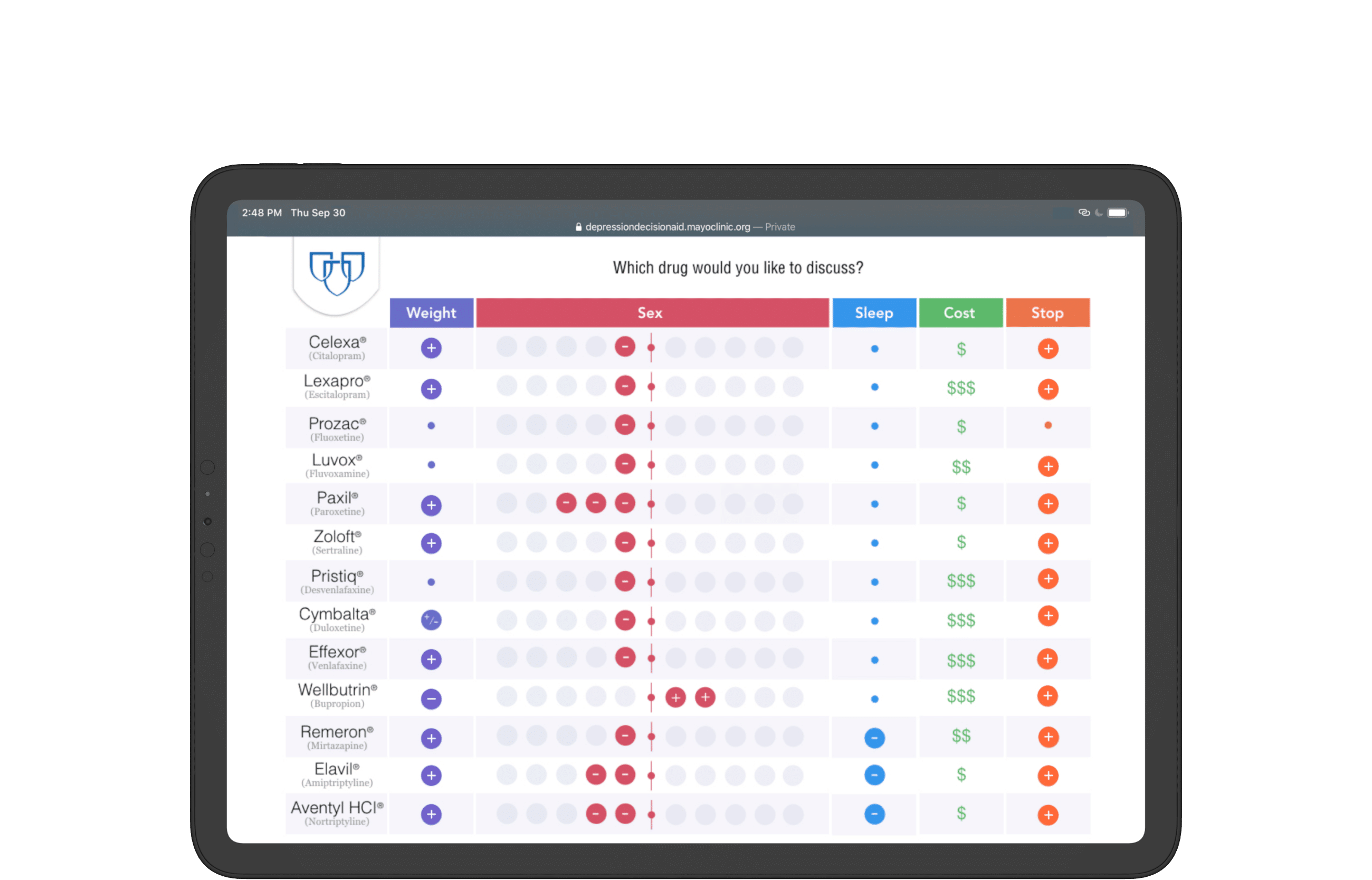
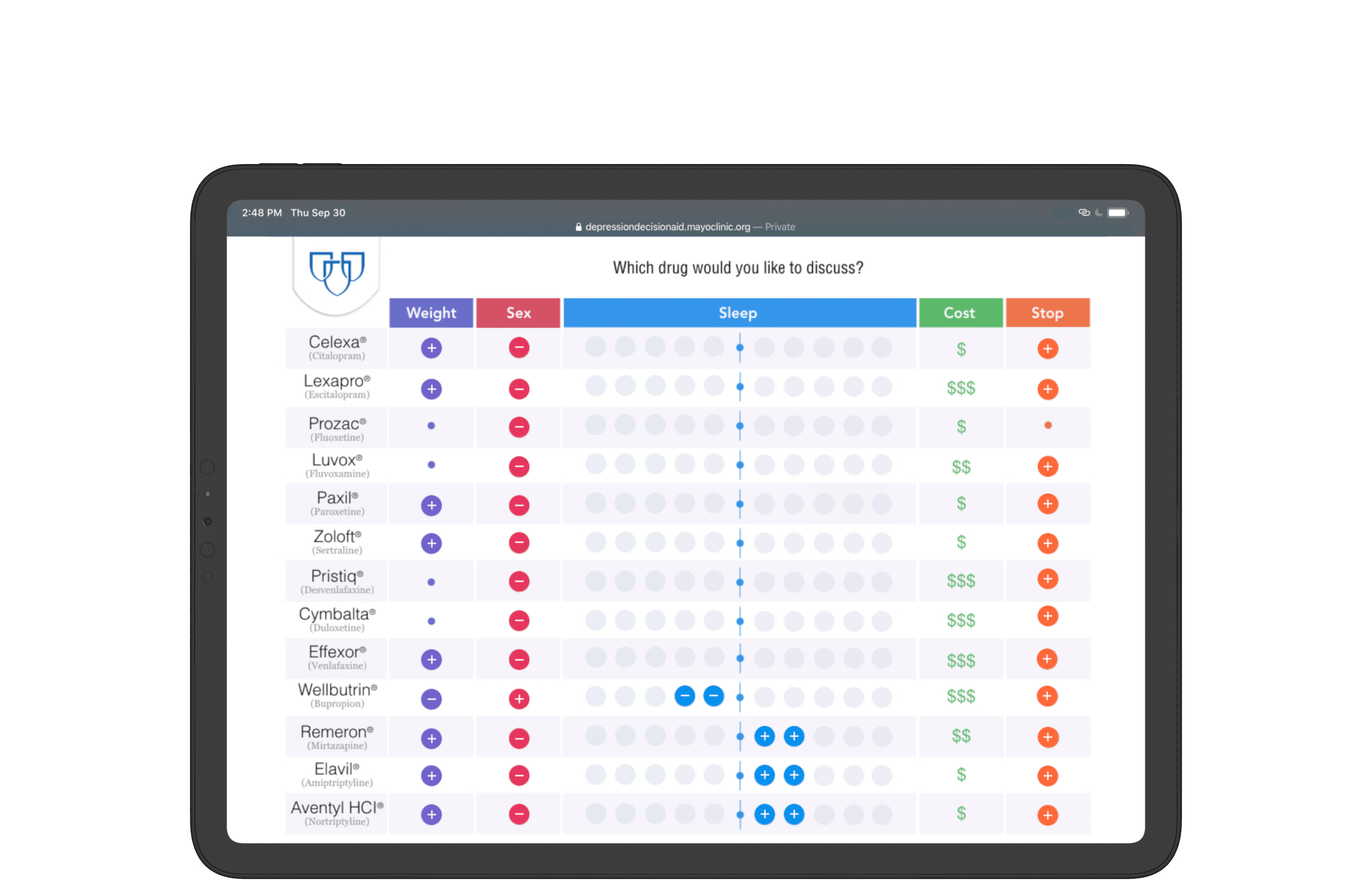
Comparison of medicine pros and cons preserved with an accordion menu;
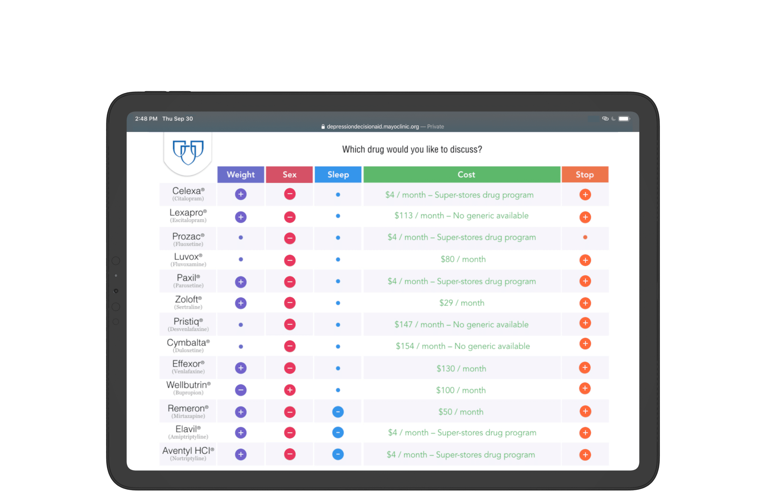
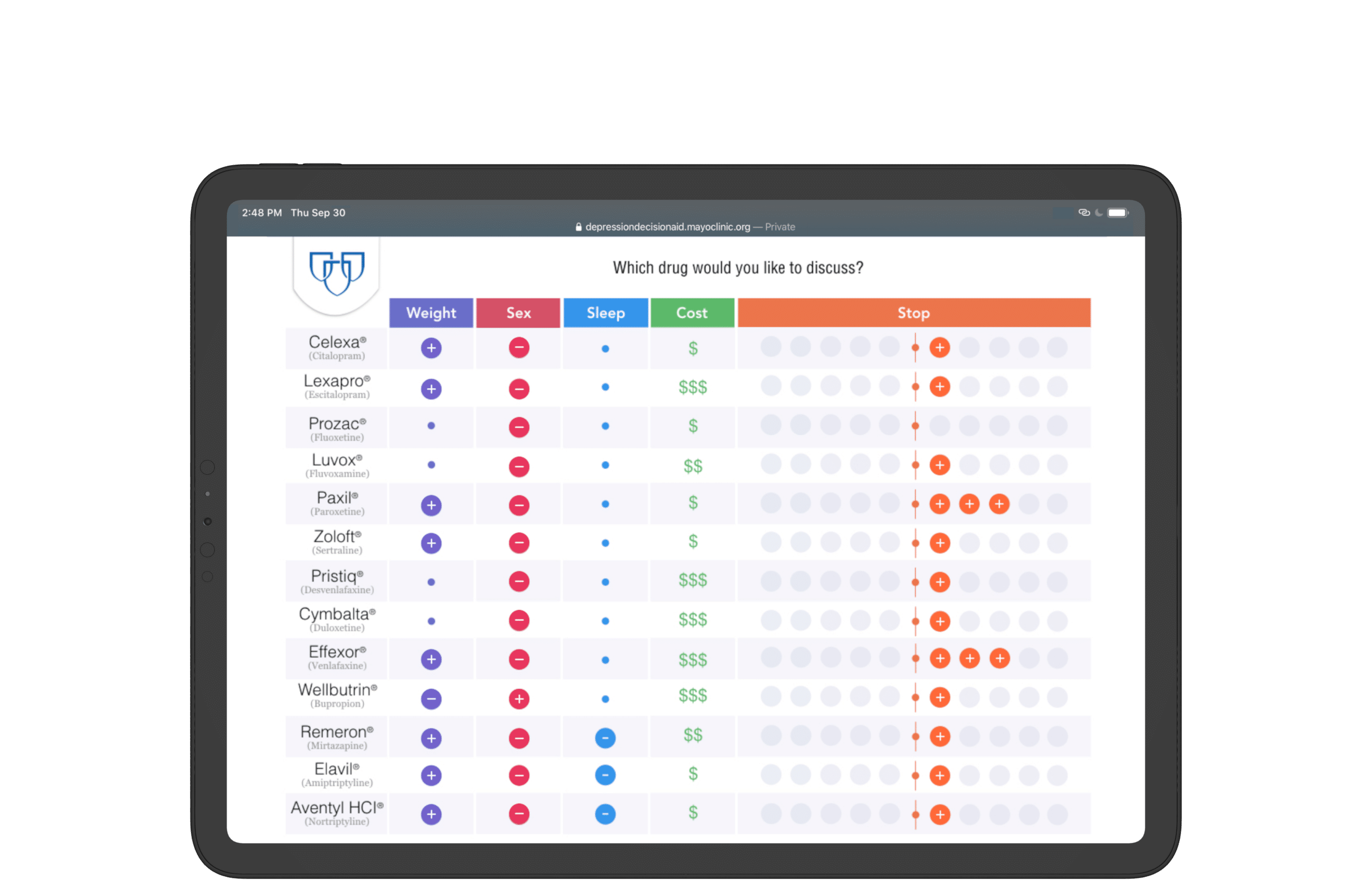
Data progressively disclosed with the collapse/expansion of columns;
Zebra stripes stylize table for scannability;
Visualization methodology and style inherits print layout for consistency.
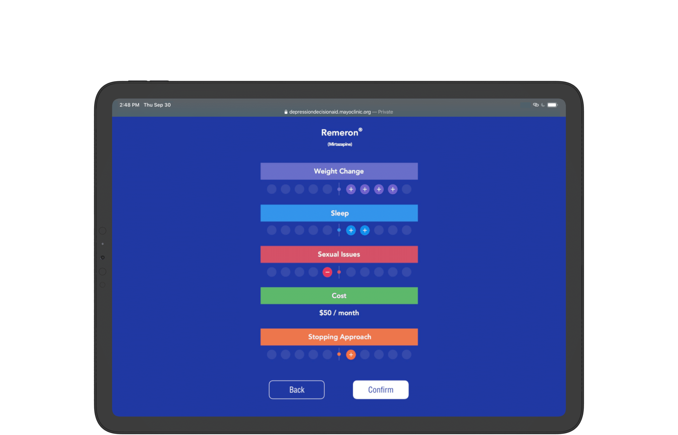
Present confirmation dialogue with all context shown once a medication is chosen.
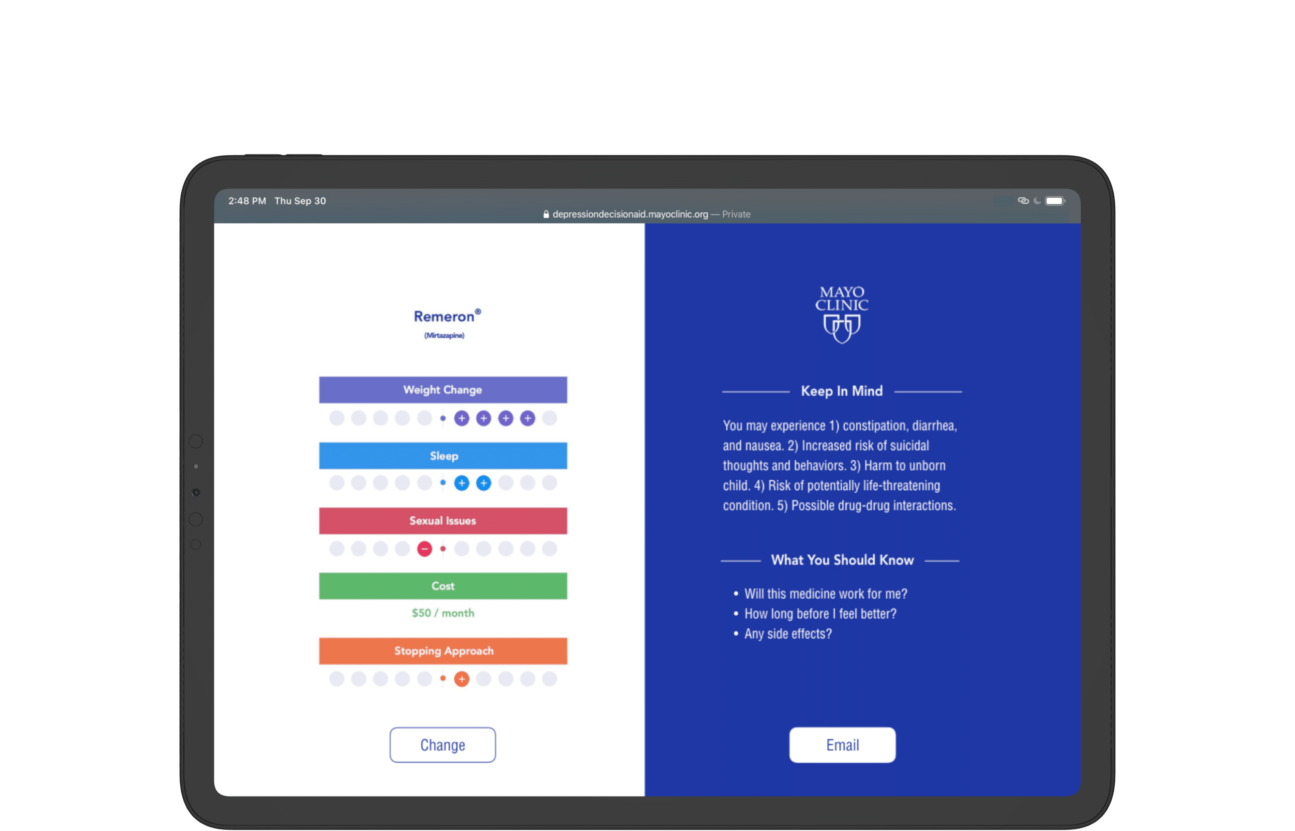
Provide the option to email a summary of the doctor's note.
The screen is merely an aid.
Post-Mortem
The decision-aid was not supposed to aid a singular decision by either the patient or the doctor. It is to aid a mutual, collective, and joint one through a conversation. In my early iterations, I believed my users would want to use the tool to select the medicine of their choice as fast as possible (complete the task given). I was wrong.
In the end, the protoype evolved throughout critiques to recede into the background by providing only browsing interactions — minimum input/output. This is so the attention of the doctor and patient may be given to each other; the most important task to actually complete is for the patient to begin conversing with the doctor.
By restraining on-screen interactions, I intentionally reserve space for that to happen. The technically simple accordion interaction and short app experience redistributes attention to what’s not in the app — the patient’s conversation with the doctor; what my project team ultimately aimed to achieve.
Dr. Ian Hargraves, Designer at Mayo Clinic made this remark during our final critique:
"The accordion menu is symbolic of space-making for the most important issue, as it expands and contracts."
5+ year impact
Mayo Clinic's Knowledge and Evaluation Research Unit has adopted my team's design vision and core user experience for deployment. The result is a functioning web app to share with the general public and research community.
Please check it out at https://depressiondecisionaid.mayoclinic.org/