LeetCode Email Campaigns
LeetCode is the leading technical interview prep tool to help software engineers get a job at top tech companies (e.g. Google, Facebook, and Amazon, etc). I joined in 2019 as the only generalist designer to lead and shape the product design process with a small and agile scrum team. In the first month, an impactful project I pushed to complete was the redesign of LeetCode's email campaign template.
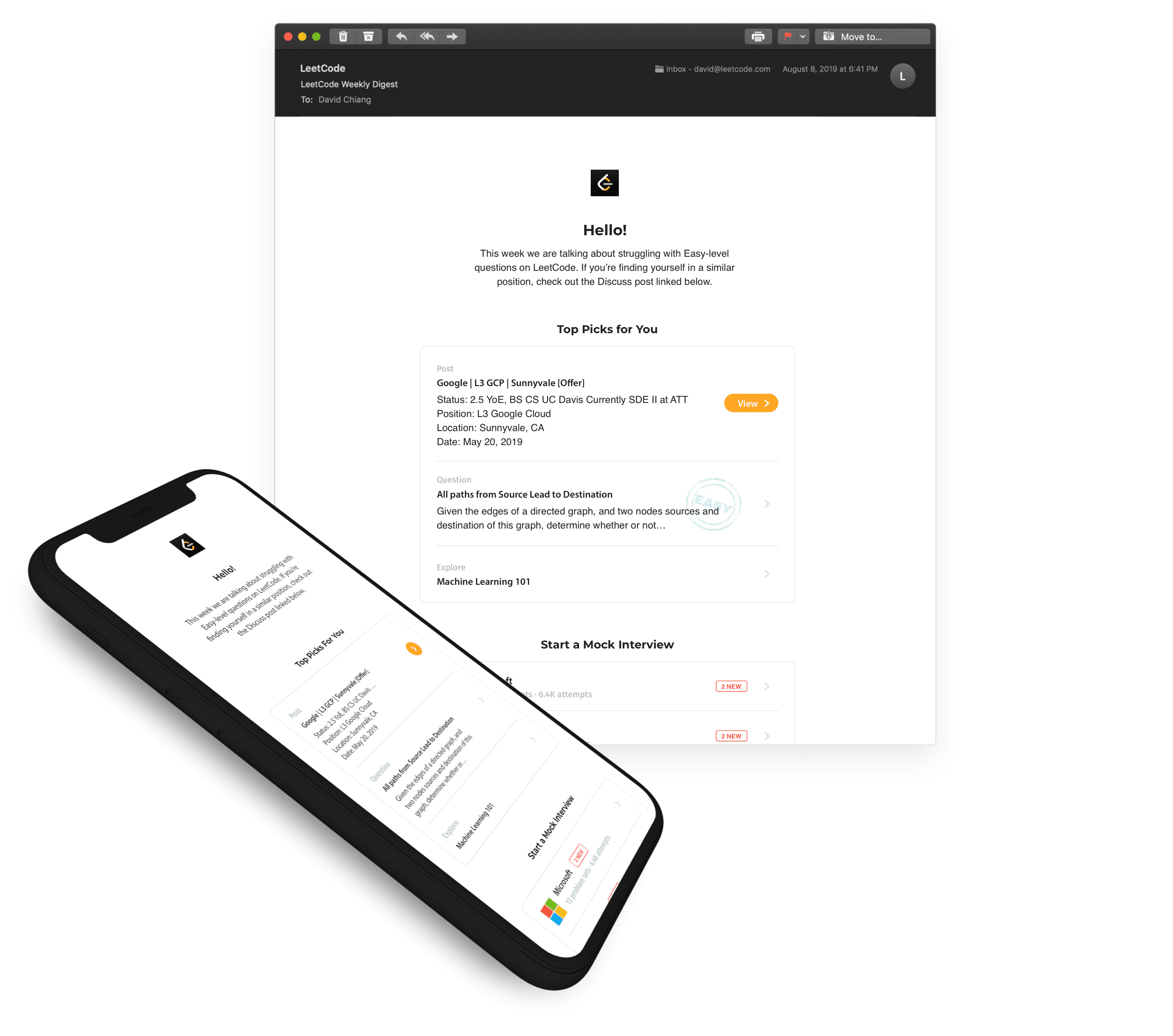
The original template has not been changed in years, and has witnessed diminishing returns in its utility. Since its first version LeetCode has gone on to develop more product features that require additional communication to our users; plus it is not mobile optimized. I set out to improve and enhance the template layout for maximum engagement and growth for our website's traffic.
Collateral:
HTML email template.
Involvement:
Scrum facilitation, requirements analysis, and UI/UX design.
Tools:
Sketch, Adobe CS, and HTML/CSS tables.

1 week design sprint + 3 weeks of development to launch.
The Goal
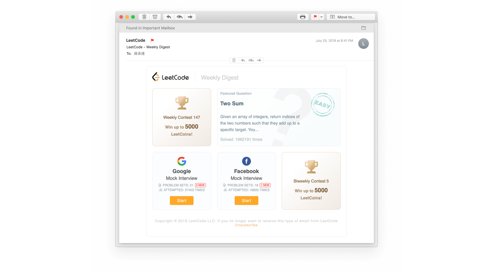
The CEO of LeetCode presented to me the problem of an outdated image asset for our existing email template (see below). Additionally, the business needed to better show case our product's new feature offerings.
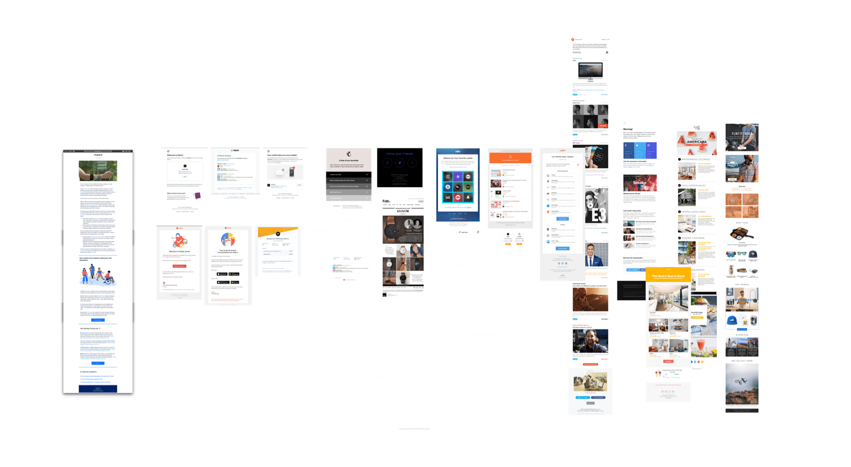
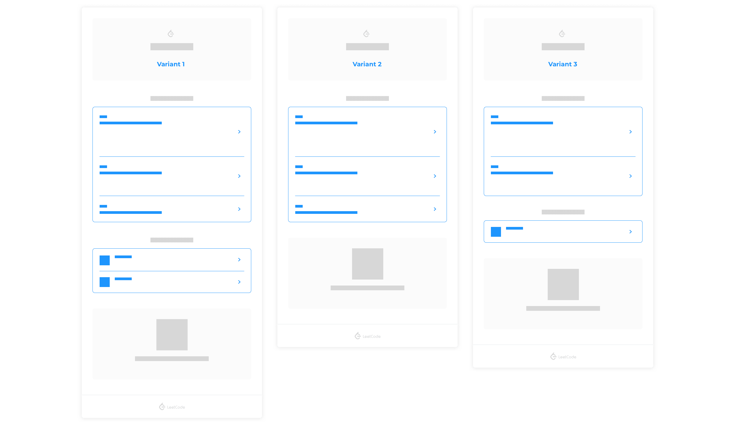
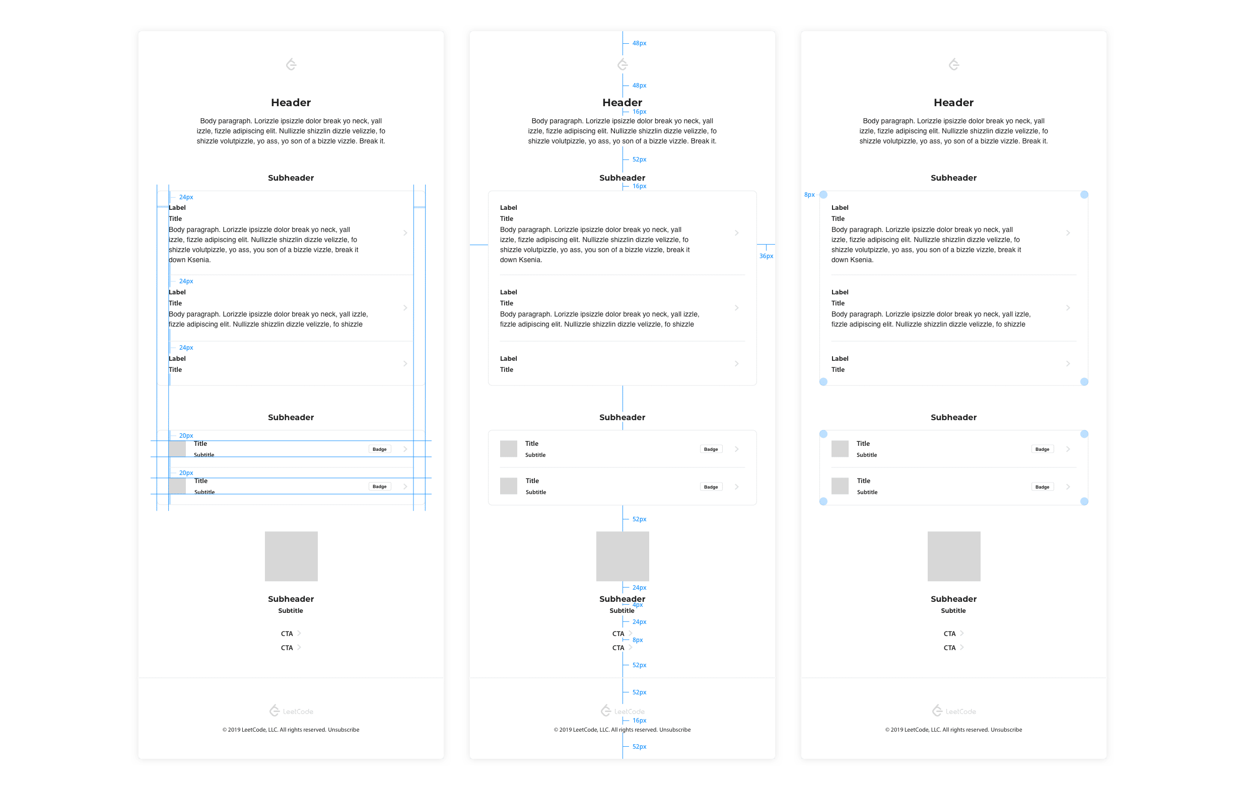
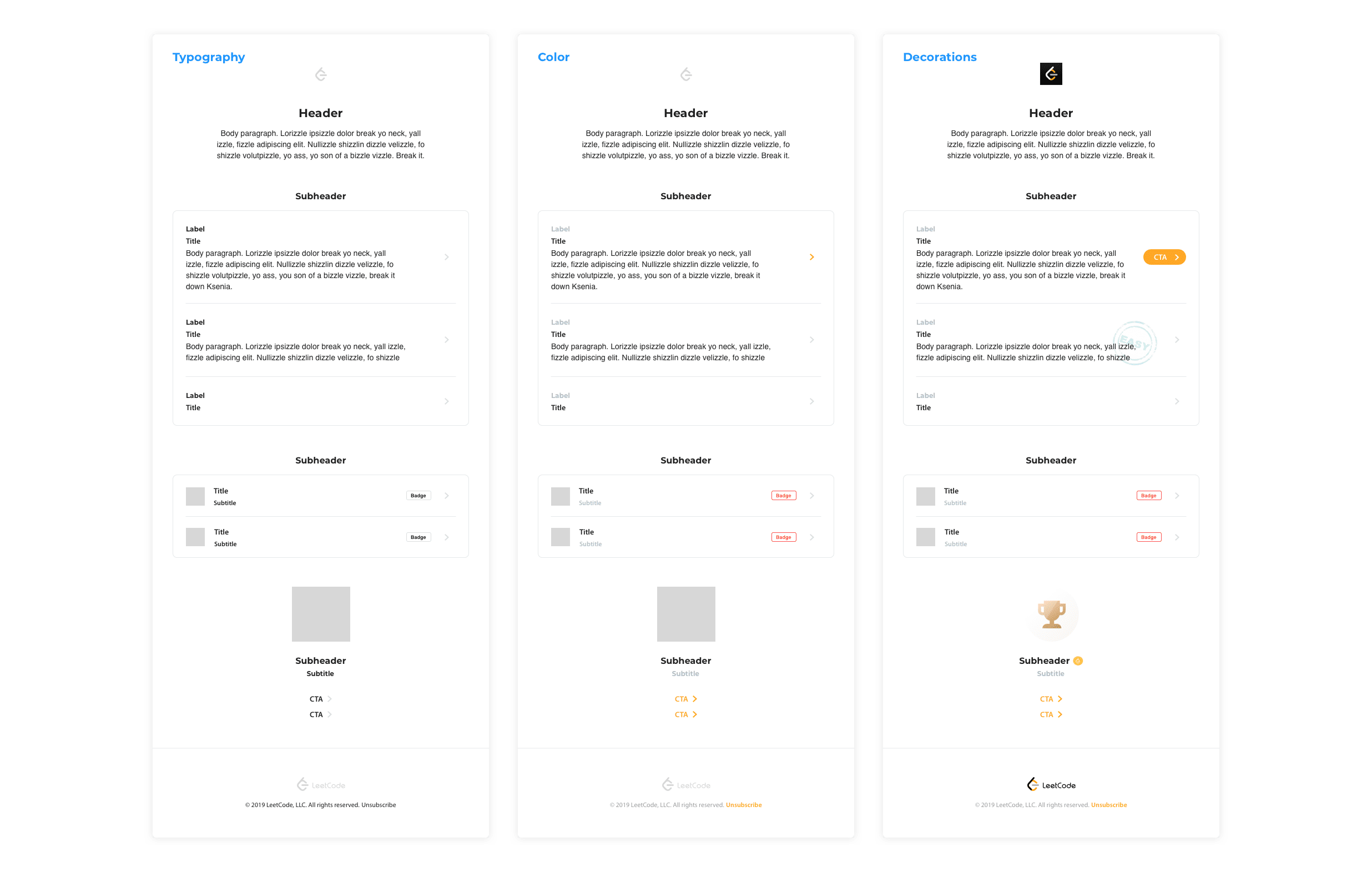
I proposed to run a 1 week design sprint to fully explore the possibilities and feasibility of potential implementations before locking down on a solution.





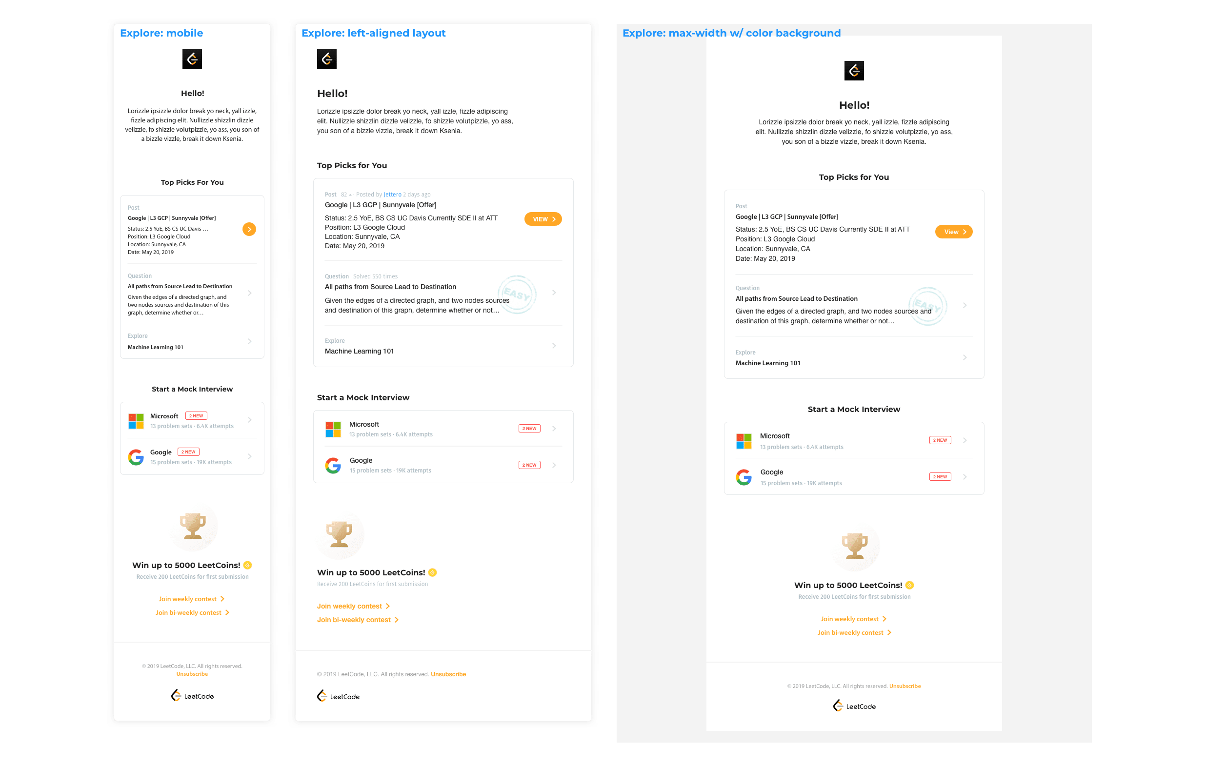

"It looks so much better!" - senior engineer
A/B Test
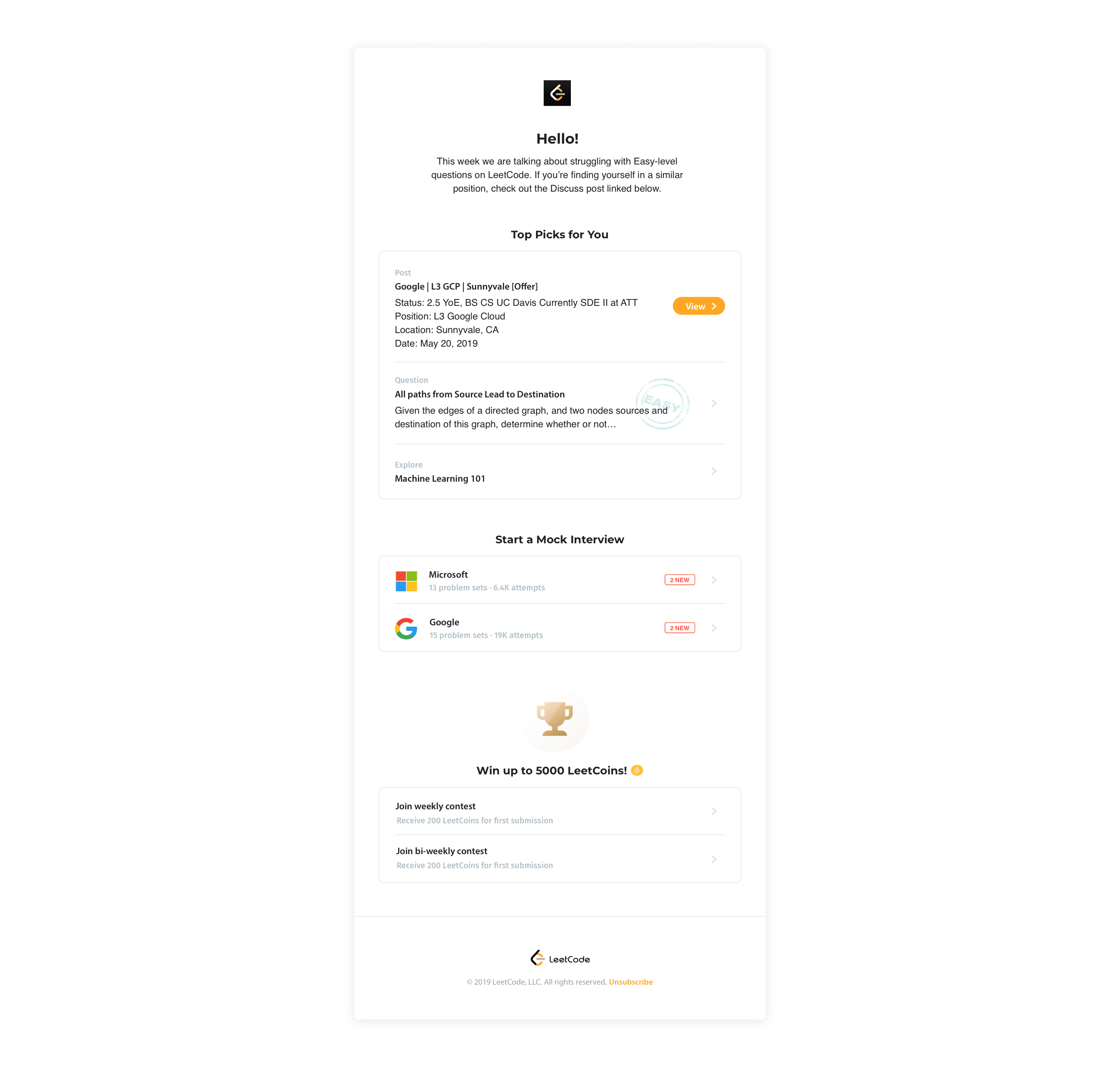
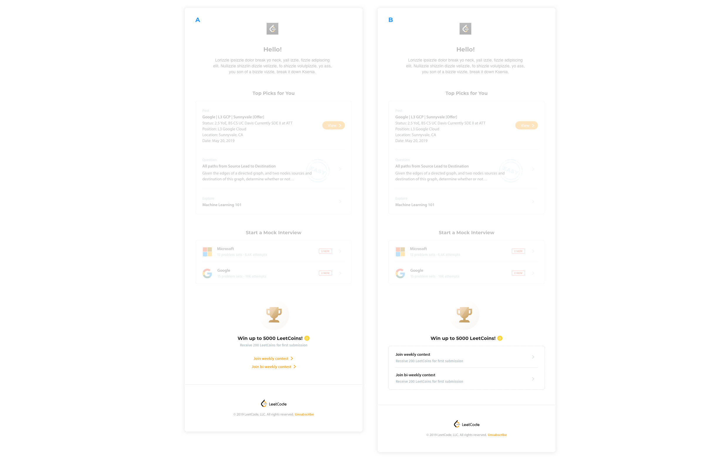
Beyond surfacing the array of product features that LeetCode had to offer, one specific goal of this redesign was to invite our users to participate in coding contests: a weekly and bi-weekly event.
The primary metric monitored was the click-through rate (CTR), with the secondary metric being the number of users registered for our contests.
Testing results showed that variant A performed similarly on the secondary metric, but declined in its CTR. Variant B outperformed with both a higher CTR and number of users registered for contests.

We saw a 4% increase in open rate over 1 month after launch.
2x Impact
Another long-term goal for LeetCode is to increase user engagement with our thriving online community. I deliberately designed a different CTA from the existing interaction design of a mobile optimized layout, to move this metric for our business.
The act of distinctively applying a button as opposed to an icon resulted in a 2x CTR for community posts links, as compared to questions and explores links (benchmarked against previous best performing link).


