UberCARE
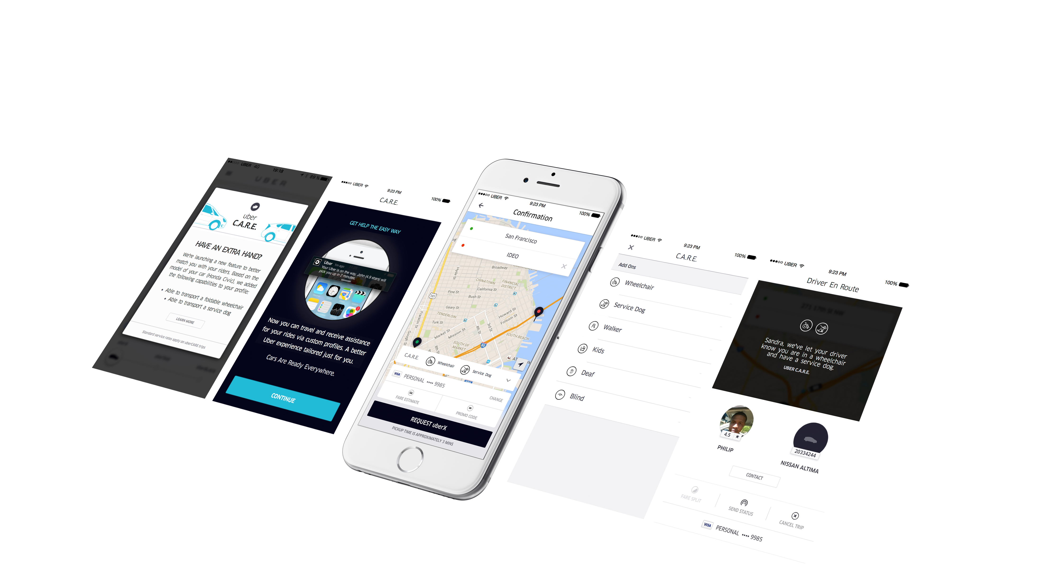
UberCARE is an academic project aimed to improve private transportation's universal access. Out of the existing transportation platforms we evaluated, Uber was selected as a case study.
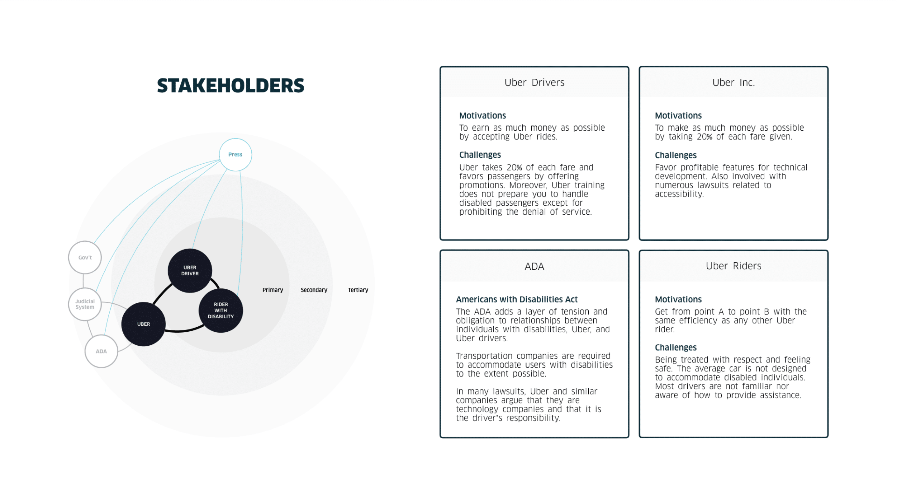
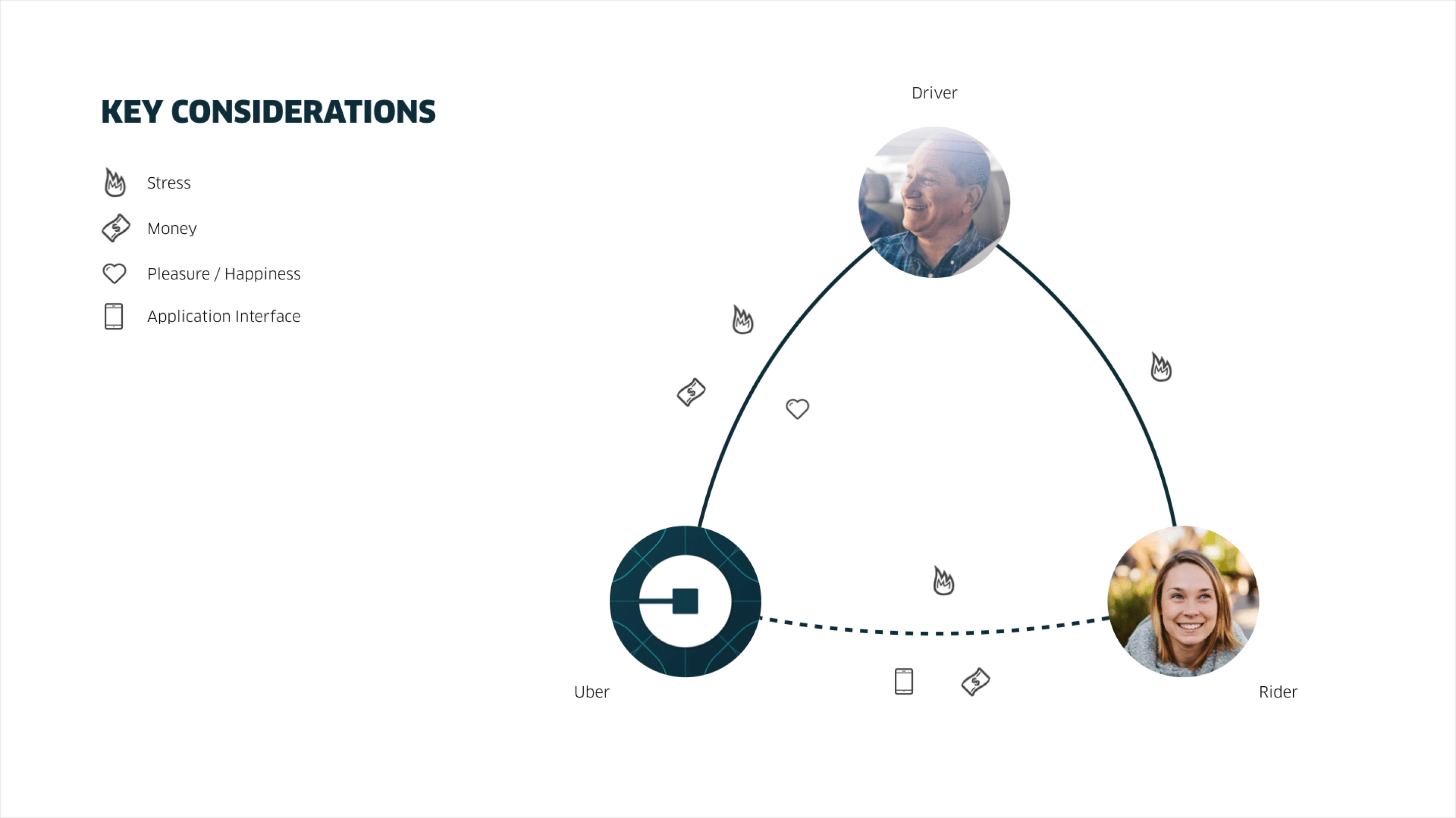
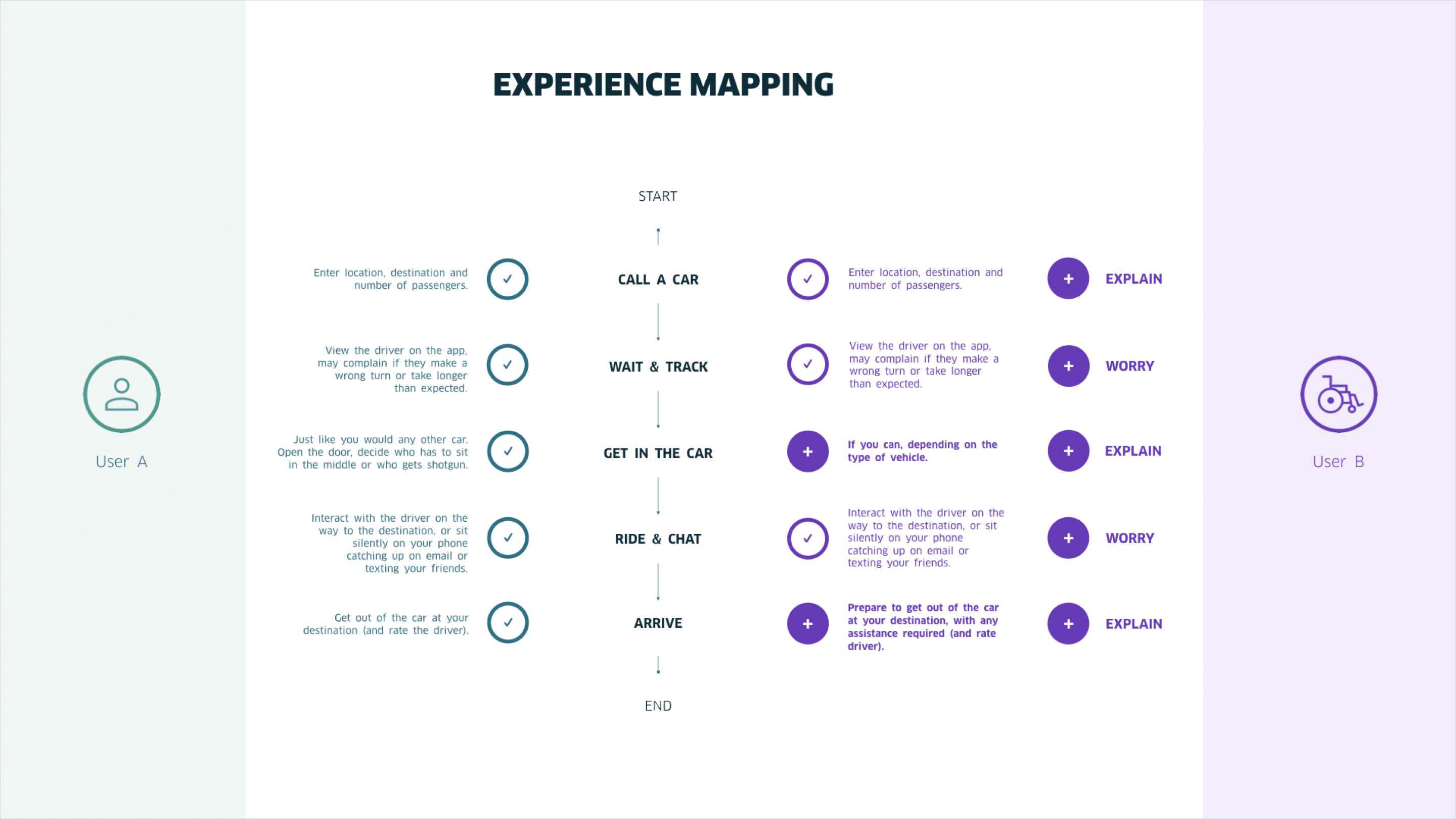
To craft an end-to-end holistic perception of Uber's collective rider experience, we held quick yet repeated conversations with Uber drivers in the field for research, mapped out touchpoints, and then interviewed a product designer from Uber. We also analyzed a rough business plan to determine financial viability. In the process, we were able to put a premium on Uber's stakeholder interests, create a prototype that respects Uber's early 2016 mobile app, as well as prepare a proposal with fine and precise language.
How might you help your customers get the experience you want them to have? You help your client organization to see its services from a customer's perspective.
Collateral:
Design exhibition.
Involvement:
Generative field research, touch point analysis, stakeholder interviews, experience mapping, UI design, video assets, and client presentation.
Tools:
Service blueprint, customer journey map, stakeholder map, and sketch.
Customers buy value in the form of experiences.

Our Process
For 3 months, we prioritized and tackled tasks with our collective skills and strengths as a multi-disciplinary team (research, design, and implementation). We rejected the notion of relying on any single person's heroics, and protected contrary opinions by giving a healthy amount of trust to each other. Diversity of thoughts was crucial to helping us pivot when necessary.
Moreover, we approached our design strategy with a sensitivity to Uber as an organization, and made sure to first investigate our assumptions through insightful research (and initiate proper stakeholder engagement). Only then, do we illustrate our conceptual ideas to align mutual understandings (and gain stakeholder buy-in). In other words, we always started our team discussions with the customer's experience and worked our way back to technology.
This in turn ensured that our design efforts were relevant to Uber. It shaped our visual diagrams in a compact way to have meaningful conversations for feedback. Further, our shared sense of reality fostered common beliefs for everyone involved in the process, and allowed us to filter through the many ideas we had.
Artistry without execution is meaningless in business.
Background
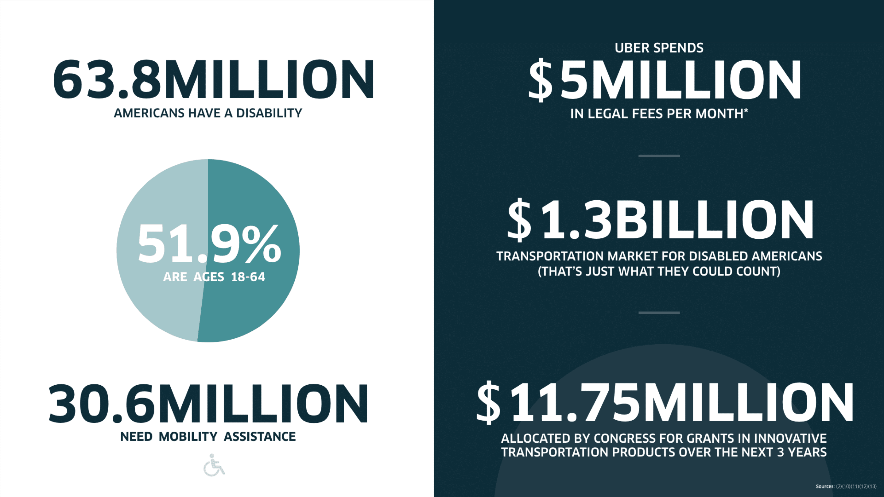
Transportation and mobility services are a growing need in the US. Over 60 million Americans have a disability. That’s one in five people, and almost half need mobility assistance. In response, the US government is spending billions of dollars each year on mobility assistance. Moreover, $11 million was allocated in 2016 by congress for grants in innovative transportation products for the subsequent three years.
Everyone deserves to go where they need to go — disabled, elderly, or with children.

The Tension
Uber has accommodated these needs in a few ways. Select cities have disability-centered services available, including uberWAV and uberASSIST. But both options are separate services, have long wait times, and with UberWAV, payment does not happen through the app. Moreover, individuals in wheelchairs may be denied a ride because the driver will not make the effort to accommodate their chair, or someone with a service dog may be turned down because the driver is allergic.
The Priority
We should not treat individuals with disabilities as different from those without. Rather we should consider the fact that many riders have special considerations — be it a wheelchair, a baby or even a pet — and evolve the service to accommodate those needs.

The Strategy
Many of us have taken an Uber before. It is almost second nature and has really made life so much simpler. They are there to give you a ride to the movies; they are the first person you call when you are in a new city; and they are there for you when you are too drunk to drive home.
We propose not a new service.
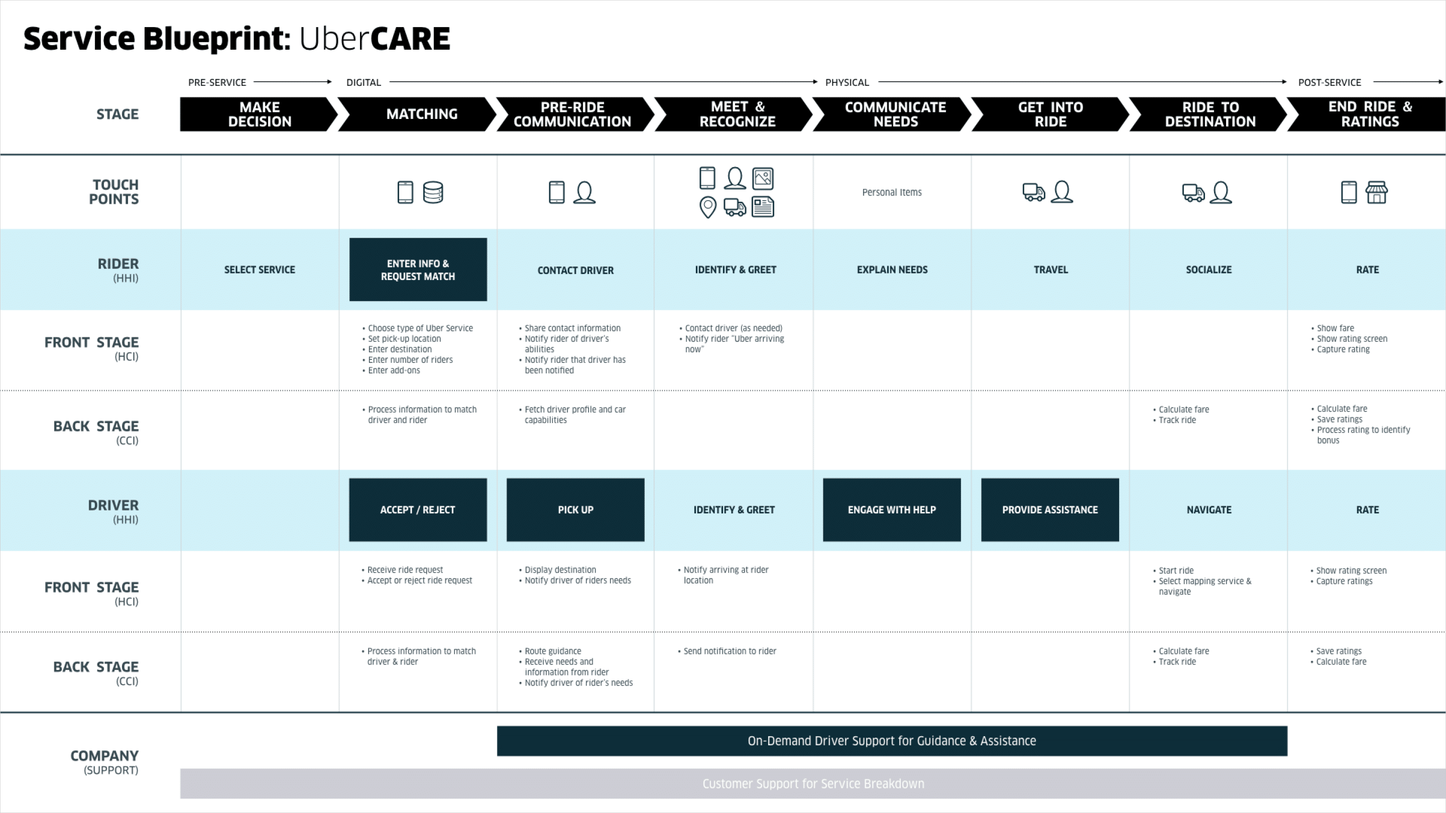
Our proposal is subtle, thoughtful augmentations of existing behaviors and expectations that balance the interests of all stakeholders. For riders, it treats everyone as equals and puts accommodation at the forefront of the experience. For drivers, it balances financial and business interests with necessary support. For the company, it focuses on relationships and trust to increase brand loyalty and product usage.
It is the way it should be.
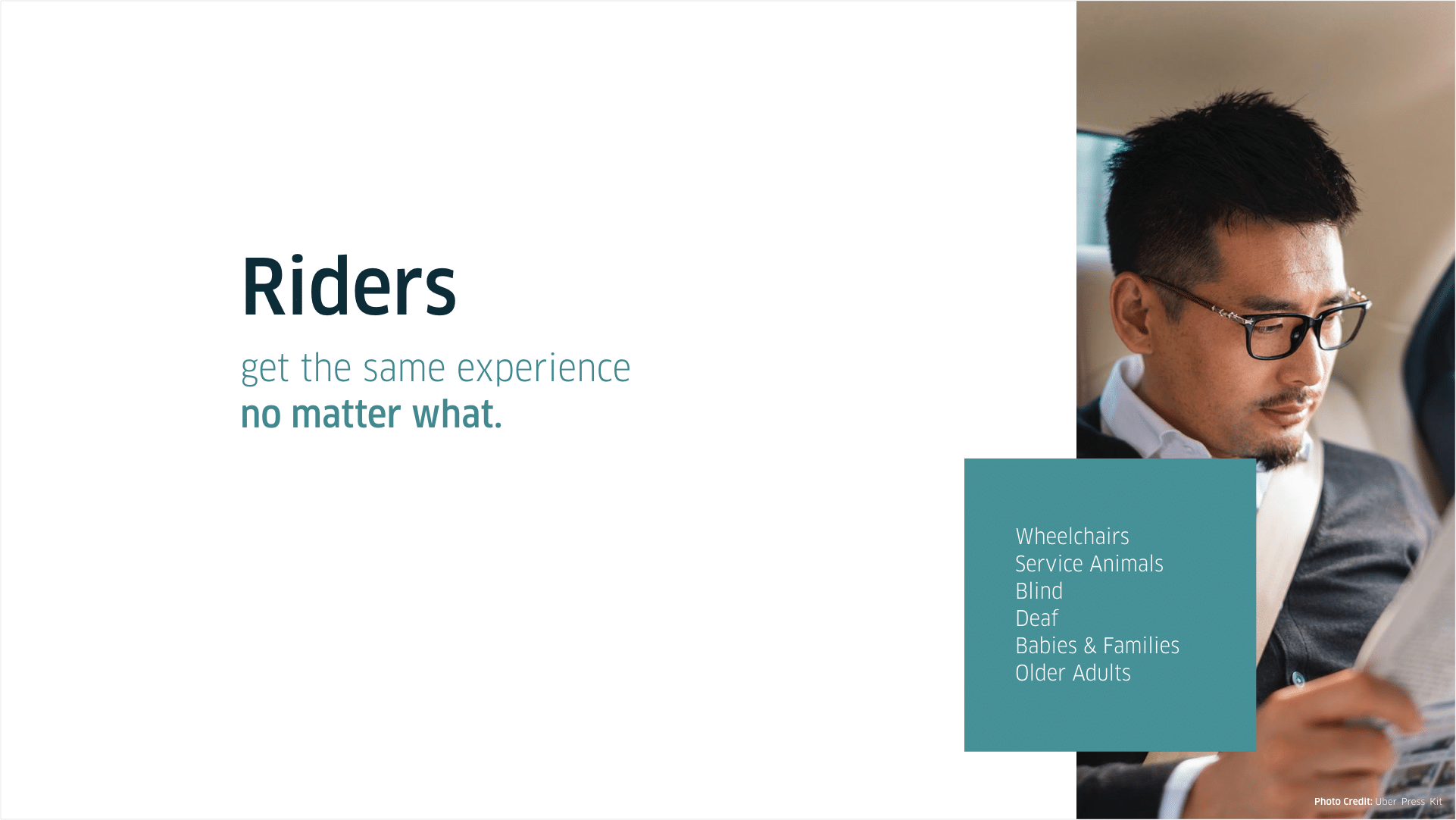
We want everyone to receive the same experience no matter what.
Incentives Structure
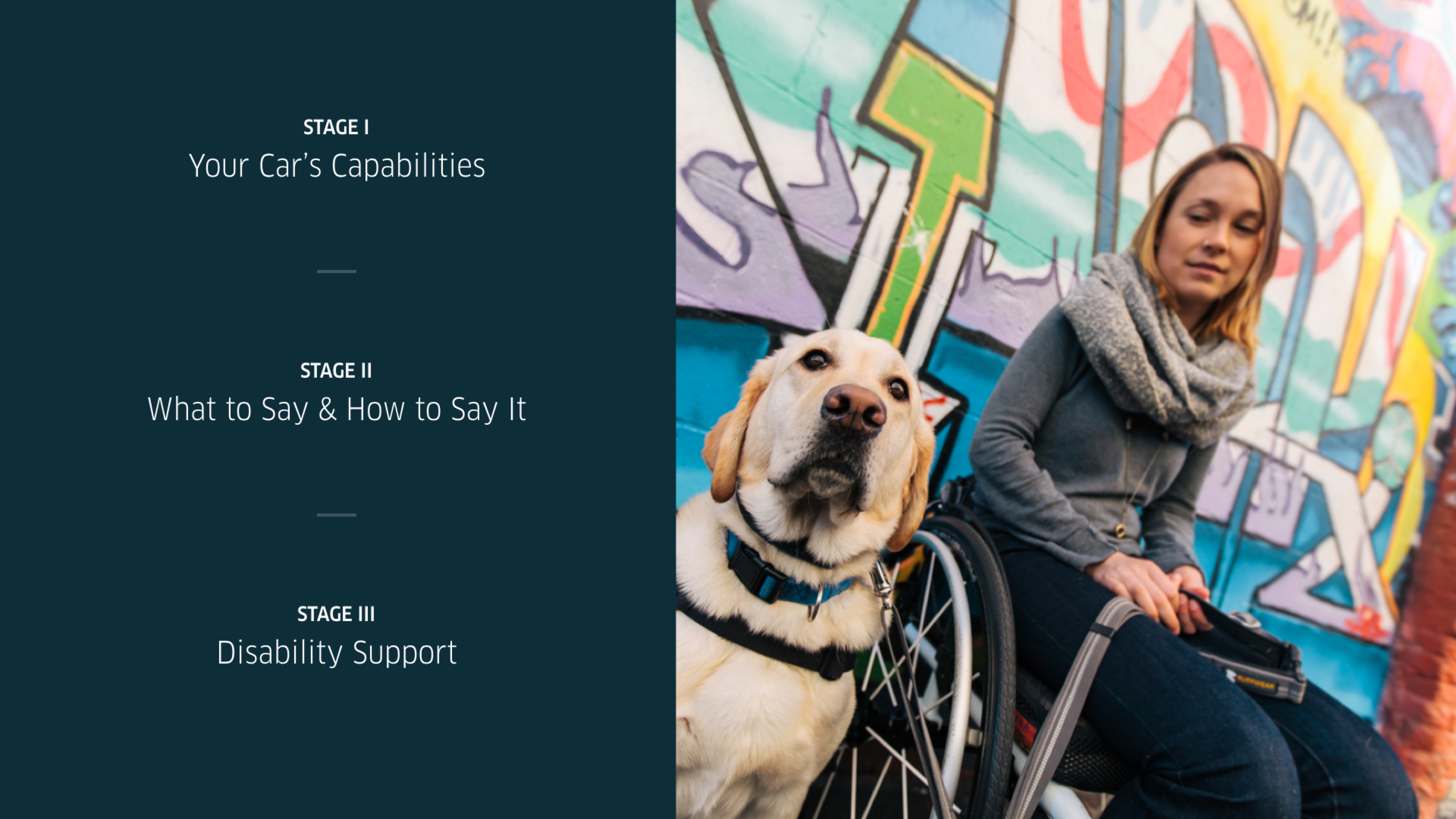
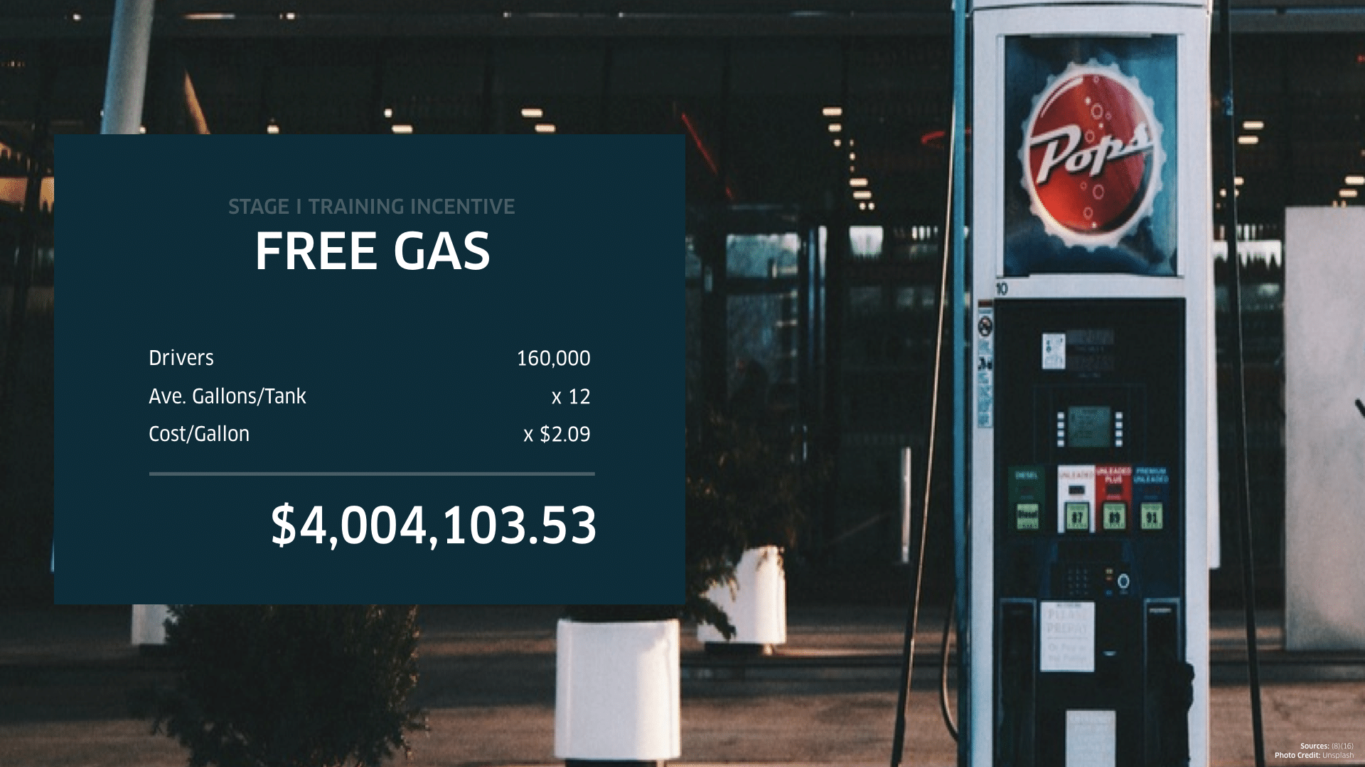
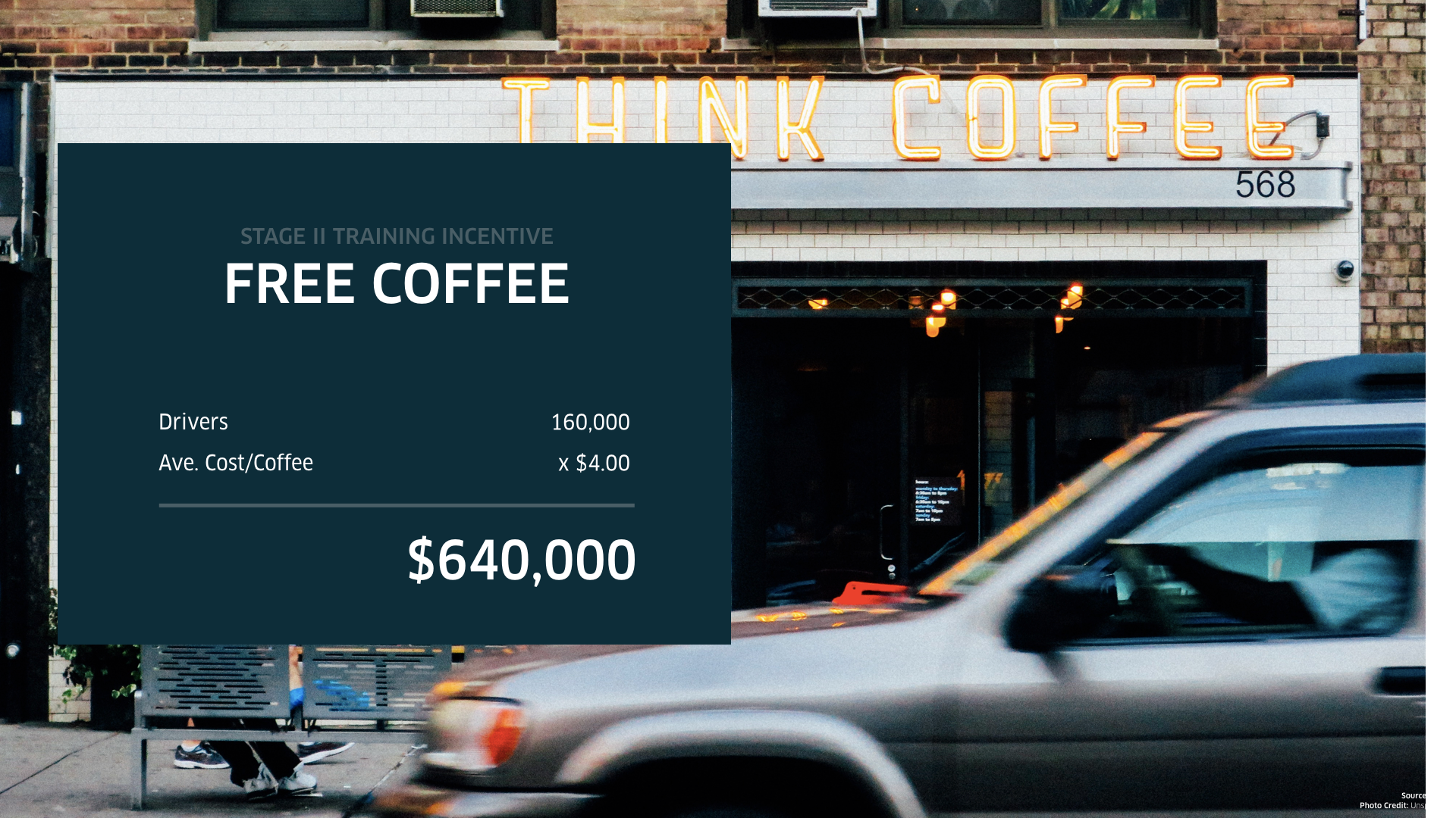
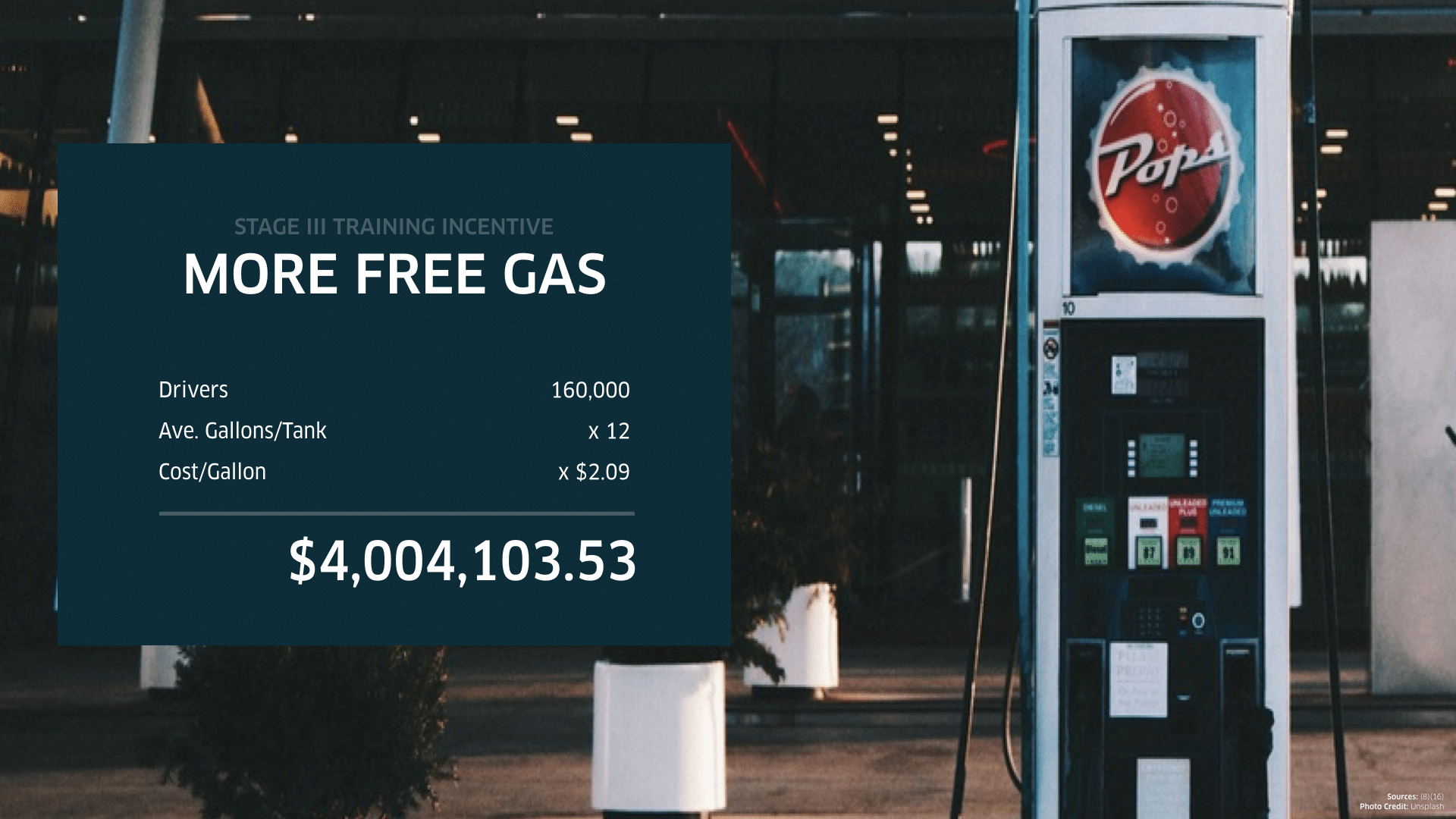
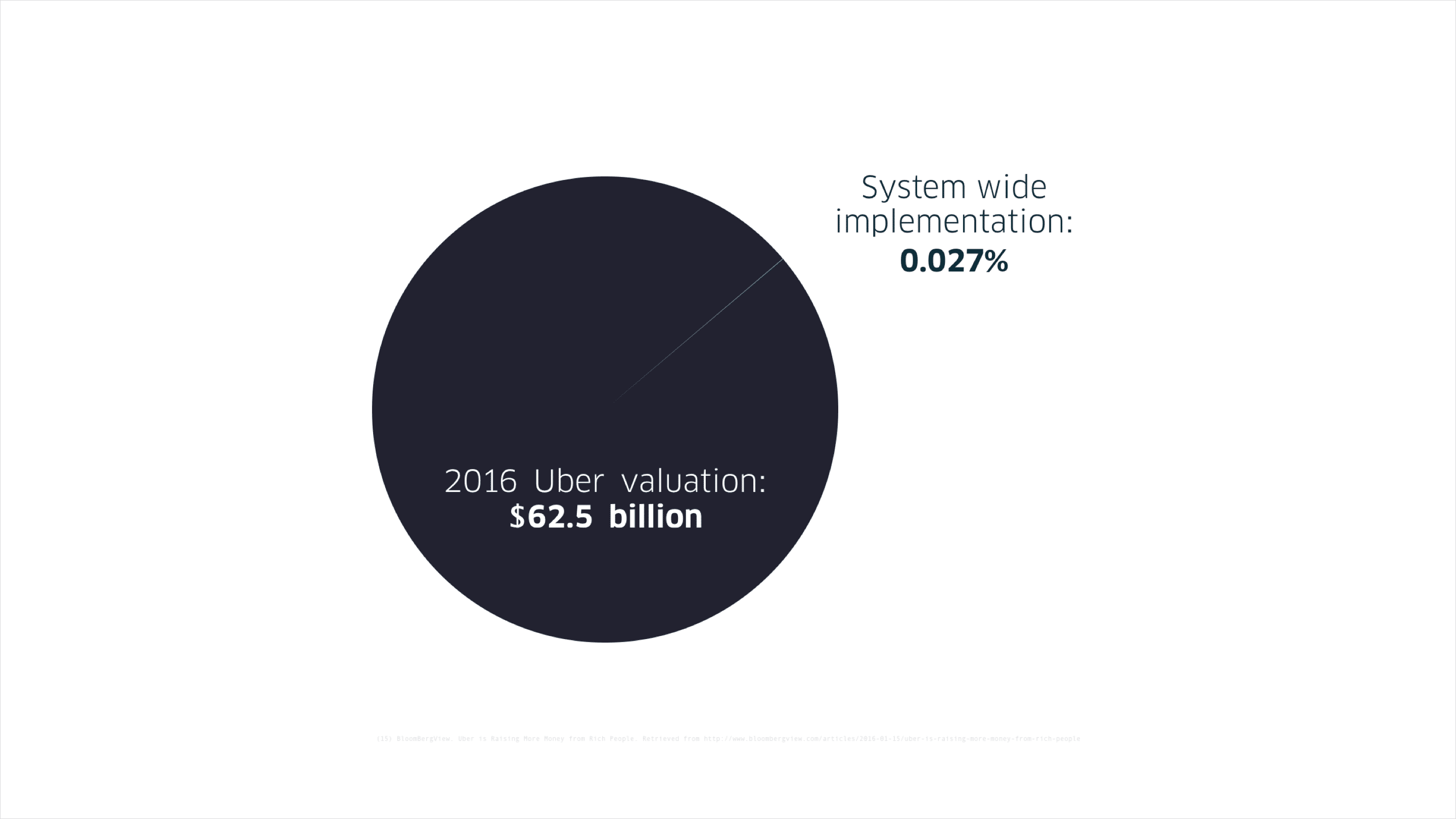
The biggest challenge for this project is devising a way to ensure adoption and participation from the drivers. It would be unusual to demand drivers to have experience in fitting a wheelchair in their cars and to have the appropriate language to address disabled persons. In light of this, we calculated a feasible system to train drivers. Drivers who practiced putting a wheelchair in their car will receive a free tank of gas, and drivers who practiced conversations with an Uber trainer will receive free coffee. Additional training for helping individuals with disabilities would also be available.
Like a rewards program, drivers can become eligible for additional bonus percentages with each completed training. Bonuses would be tied to Uber's existing 5-star rating structure.
Action Steps
Uber as a company can make this happen in three steps:
01 Uber needs to set aside a team by pulling in the skills and knowledge necessary — software development, product management, PR, UX, and legal, etc. — a whole dedicated unit that oversees cross-functional responsibilities at Uber HQ.
02 The dedicated team would have to then set a mission: to balance the assets and the risks of the company with value creation. Assets means existing technology, driver base, brand equity, money reserve, and staff talent. Risks means budget, uncertainty of integration, and potential driver backlash. Value means consistent quality that would engender brand loyalty, increase market share with a new customer base, and as a result increase revenue, raise the level of excellence, and demonstrate goodwill. This all would help to facilitate the integration of UberCARE into the Uber ecosystem.
03 A successful implementation would require a careful execution of the product strategy. A service involves real people and would benefit from community outreach and tested evidence for UX insights. The team must strive to balance the aesthetic style of the user interface with real customer needs.
This is UberCARE. This is simple. This is the same service for everyone, no matter what.
UberCARE was included in the MA Design is Human 2016 Exhibit in Atlanta.
Recent Updates
Share economy apps discriminate against people with disabilities. Try, as my brother has many times, to get an Uber with a wheelchair ramp or an Airbnb with accessibility. They don’t exist. In 2019, multi-billion dollar companies don’t follow the ADA, and no one seems to care. pic.twitter.com/cJ9NK7oTrn
— Nate Waterfill (@N_WaterfillBDU) March 27, 2019
OMG gang! A win for disabled travellers!
— Ginny & Tonic (@GinnyAndT) April 1, 2021
A San Francisco woman has been awarded $1.1 million by an arbitrator after Uber drivers repeatedly denied her rides because she is blind and uses a guide dog.https://t.co/LEMEKBjfPO
A judge has ruled three disabled plaintiffs have standing to sue Uber for refusing to offer wheelchair-accessible rides in their hometowns of New Orleans and Jackson, Mississippi, even though none of them have downloaded its app. https://t.co/SO4mlsYu8z
— Courthouse News (@CourthouseNews) August 26, 2021
Uber recently announced new features that allow individuals with disabilities to self-identify within their app and customize their accessibility preferences. Learn more about these features: https://t.co/a8C3gQBHFL
— RHA Health Services (@RHAHealth) November 10, 2024
